
Site Designer
Contents
Site Designer
- Customizing Your Style
- Template Info (information about your design)
- Screen Size
- Add Custom CSS
- Revert to Default
- Save Style
Body and Body Links
Page Wrapper
Header, including the logo
Website Name and Tagline
Horizontal Navigation and Submenu
Horizontal Navigation Wrapper
Nav Column and Text Links
Nav Headers and Nav Links
Content Column
H1-H4 Headlines
Image Block, Captions and Caption Links
Ordered and Unordered Lists
Divider
Extra Column and Links
Social Sharing and Social Destinations
Newsletter Opt-in Form and Label
Newsletter Opt-in Input and Button
Newsletter Opt-in Link
Callout Box and Links
Reminder Box and Links
Reminder Box Headline and Text
What's New Box
What's New Box Headline and Link
What's New Box Item Link and Date
What's New Box Item Text and Read More Link
Footer, Footer Links and Footer Wrapper
Stripe1, Stripe2, Stripe3
Responsive Grid Block
Responsive Navigation, Links, Headers
GDPR Cookie Consent, Button and Links
FAQ Block, Q/A Pair, FAQ Question, FAQ Answer, FAQ Answer Links
Important Note
You need a modern browser to use Site Designer.
Please review this information to ensure that your browser version is up-to-date.
There's also a link to download the most recent version if you're using an older version...
Proper Browser and System Settings
The Site Designer is where you choose which template you want to use for your site's design.
Select from several responsive designs. There are at least three in each category.
Some of them are 1-column designs, including some stripes-ready designs. There are also seven "blank" Custom templates to allow you complete design freedom.
You can also customize the template you select to get it looking just the way you want it. You'll see your changes appear immediately, as soon as you click a button or make a selection.
Some will happen so quickly that you may not see them change. If you've waited more than a second or two, check closely. You'll probably find that your change has already been made.
Your first time in Site Designer, after registering your domain name, the Gallery will open for you. Select a style to customize with Site Designer's tools.
Click here for help with selecting a design in the Site Designer Gallery.
Important Note
You have the option of choosing a stripes-ready template. Here's an example of what a site using stripes looks like...
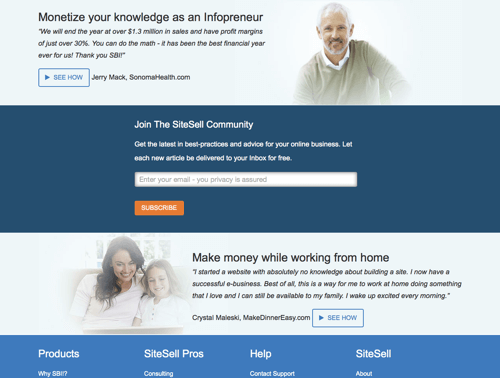
If you select a stripes-ready template, both the visual designer and the menu of customization options will appear differently from a template that doesn't use stripes.
Below are screenshots of the differences...
The default menu when your template first loads into Site Designer...
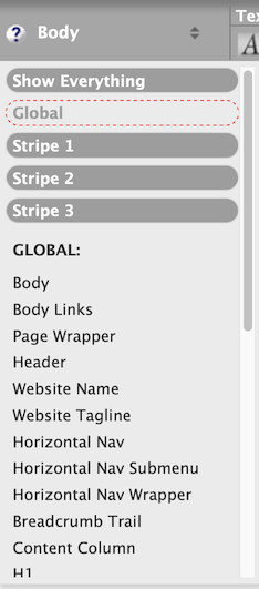
Global allows you to customize elements in the template for all three stripes. Use this for settings you want regardless of the stripe, such as the site's font size and the default typeface.
This is also where you customize elements outside the three stripes, such as the header, the website name and tagline, GDPR Cookie Consent, and the Footer.
The top (first) stripe's default background color and red dashed line indicating where the stripe starts...
Bottom of the first stripe, with the Switch to Extended Layout button, the red dashed divider, and the top of the second stripe (with a darker gray background)...
The Switch to Extended Layout button displays items that are hidden in the basic layout, such as the Newsletter form, the What's New Box, the Responsive Grid, and the Callout and Reminder Boxes. Customize those (if you want to use them) for each individual stripe.
Click here to read the help for customizing a stripes design. Be sure to also read the information below.
Customizing Your Design
- Customize the Body (the default).
-
Move on to the Page Wrapper, the Header, the Website Name and the Website Tagline.
Then the Horizontal Navigation and Menu Button, the Nav Column and its contents (if applicable), the Content Column and its contents, the Extra Column (if applicable), the Footer, and the Responsive Navigation. - Click on Save Style after every major customization (Page Wrapper, Content Column, etc.). If you're editing the design, save the template after all the edits.
Site Designer allows you to customize various parts of your template. You do that in the Style Editor.
When you enter the Style Editor, you'll see your selected template exactly as is from the server, or exactly as you last saved it with the Save Style button.
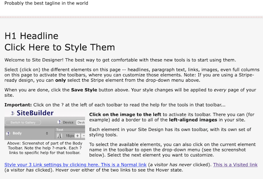
In the gray bar that runs across the page just above the template, you'll see the toolbar for the "Body" part of the template.
This is the default toolbar, which you'll see every time you open Site Designer.

Click on the help question mark beside the word Body for help with that toolbar. Every customizable section of your style has its own toolbar, and its own help.
Click on that section of the template to change to the new toolbar. The section that will be customized is then highlighted with a red border...

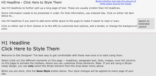
You can also access each toolbar by clicking on the small triangles to the right of the section names...
As you can see in the screenshot on the right, the selected section is highlighted with a red border, just as another one is in the template itself (screenshot above).
Click on a different section name to highlight it. The corresponding section in the template itself will also highlight. The toolbar will change to the one for the new section.
When you're done with the new section, click on the triangles to select the next section to customize. Or click on that part of the template (for the Page Wrapper and the Stripes, use the triangles only).
Once you're satisfied with each section's design changes, click on Save Style to save them, or continue working without saving them. Move on to the next section.
Very Important
Every time you click on Save Style, your customizations are added to any pages that are already published.
The first time you customize your template (after registering your domain name), clicking on Save Style will give you the option to then create and publish your home page, or to continue customizing your template.
Below is a list of every editable section of your template, with a link to the help for each section.
Begin by styling the "Body."
If you want to customize the images used in your style (header image, and any background images for the body, page wrapper, columns or footer, you can download them all in one zipped package by clicking on this link...
https://sbiapps.sitesell.com/sitebuilder/blockbuilder/
transitiontemplate?type=package
You must be logged into your account to use this link. If you have more than one site, you must have that one active (check the top right corner of any page for the domain name) in order to download the package for that site.
Common Terms and Actions
Button borders indicate whether a button's styling is active or inactive (or always active).
An inactive button will have no border around it. Click on the button to make that styling active. Examples are the bold and italic buttons for headline text. These are off by default for most templates, until you click on them.
An always active button does not have a border around it, since it can never be inactive. An example is the font button (the one with the A on it). Since a font, by definition, is always selected, the A button is always active.
A different type of always active button are the font size buttons for text (first screenshot below). Since text always has a size, the increase and decrease buttons are always active. However, there's also the option to click on the number to the left of the + button, to type in the size you want. See the second screenshot below.
An active button will have a border around it. This indicates that the button's styling has been applied to that section of the style. Click on the button to deactivate the styling. An example is the Align Left button for the Body's text. Since left-aligned text is the easiest to read, the default for all styles is Align Left. So this button is active.
You can see all three types of button in the screenshot below. The A button, size buttons, Color Palette button and Gears (Advanced Styles) button are always active, the Align Left button is currently active, and the other three alignment buttons are inactive.
In this screenshot, the font size edit option is active. A new font size can be typed into the small text box.
Tip
-
Don't be afraid to "play around" with your style before building your home page. If you've made some changes, and decide you don't like them, you have two options...
Click on the Site Central link in the top right corner of the tool page. That will leave your style with the last changes that you saved with the Save Style button.
The second option is Revert to Default (discussed below).
Template Info (information about your design)
- Hover over the word Template Info. A tooltip will appear with the design name, layout width, and width of the columns.
The Template Info button in the top left provides the same design metadata that you saw when you previewed the design.
To view the metadata, hover over the button. A tooltip appears.
You'll the design's name, along with the layout width and the width of the column(s).
Screen Size
- Style the desktop version of your site (the default view) in Site Designer.
- Click on the tablet icon to style for tablets.
- Click on the phone icon to style for mobile devices.
Responsive designs respond to the width of the device window (viewport) showing your page.
So you need to design for desktop, wide device windows (most phones in Landscape orientation, and all tablets), and narrow device windows (most phones in Portrait orientation).
You do that by clicking on the Screen Size icons, at the top of Site Designer (the red dashed border around the computer icon indicates that Desktop will be customized)...
Before you customize the design for mobile, customize it for Desktop. Then...
There are two screen widths to style for, 447px and narrower (phones in Portrait orientation), and 768px and narrower (tablets, and phones in Landscape orientation). Design for 768 first, since the changes you make to it will apply to 447 as well. Then design for 447 and narrower.
To do that, click on the tablet icon. You'll immediately see your site as it will look (although not exactly) in an iPad. Then click on the phone icon to style for phones in Portrait (vertical) orientation (447 or narrower).
Once you're done styling the mobile version (mobile changes do not affect the desktop or tablet version of your site), click on Save Style (discussed below) to save your customizations.
As you build a page, you will be able to view how it will look in each device, using the same Device options.
Add Custom CSS
- Click on Add Custom CSS and add the custom CSS code.
- Save your custom CSS.
- Click on Save Style to save your template with the custom CSS added.
If you want to style something that has no access in Site Designer, you can add CSS for it.
Click on the Add Custom CSS button and type or paste in your CSS code for the items you want to style.
Save the custom code. The overlay window will close and your Site Design will update with the changes you added.
Click on Save Style to save your new CSS to your template.
If you add custom CSS to your design, then switch designs, that custom styling will be lost. Solo Build It! gives you a warning message so that you're aware of what will happen.
The message has the option to return to the saved design, or to select the new design and move to Site Designer to customize it.
If the custom CSS is something you want to add to the new design, return to the saved design, copy all the styling code in Add Custom CSS, and paste it into a text document. Then go back to the gallery and choose your new design. In Add Custom CSS, paste in the styling code from the text doc.
Tip
-
How do you know what to put in the Add Custom CSS box? After you've built at least one page, view the source code for that page. Do a find (Ctrl-F/Command-F) for "id=" (no quotes) and also "class=" (no quotes).
These two finds will return every instance of "id=" and "class=" in the source code. You can then customize those IDs or classes.
If you add something from a third-party, that provider will usually include CSS. Add that to your site design as well using Add Custom CSS.
Revert to Default
- Click on Revert to Default to undo all styling changes.
Once you've selected your style, you can customize it (see above).
If, at some point, you decide you want to start over with your style, click on Revert to Default.
That will undo all of your changes, leaving you with the original style that you selected from the Gallery.
Save Style
- Click on Save Style to save a customization of a new or existing style.
- Click OK to confirm that you want to save the customization.
After making any changes to your site's design, whether it's choosing a new style, customizing your existing one, or reverting to the default version, you must save your new design.
Do that by clicking on the Save Style button in the top right of Site Designer. Then click on OK to confirm it.
Unless you do that, any new style you've selected, or any customizations you've made, will not be saved, and will not appear live on your site.
The first time you save your site's design, the overlay will have two options, OK and Go to BlockBuilder to create home page.
If you're ready to build your home page, click on Go to BlockBuilder to create home page. If you're not ready yet, click on OK. The next time you log in to SBI!, you will be taken to BlockBuilder to build your home page.