
Styling Social Sharing and Destinations Bars
Contents
Styling Social Sharing and Social Destinations Bars
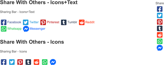
There are three social sharing options -- Icons+Text, Icons (only), and Sticky (icons only, in a vertical or horizontal format).
In addition to sharing, SBI! has a Social Destinations option, which lets you create icons for visitors to click on to visit your social media pages or accounts.
Below is a screenshot of the three sharing options...
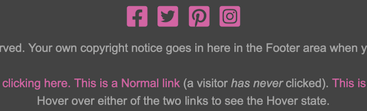
And this is a screenshot of some Social Destinations icons. Note that these icons can take on the link colors you set for the footer or other area of your template. So yours will look different than the ones in this screenshot.
Social Sharing Icons+Text
The Social Sharing Icons+Text bar includes the names of the various social platforms. So its toolbar includes options to customize the text, the icons, the border, the position, and the background.

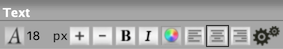
Text
You can customize the following text options for the Icons+Text sharing bar...
-
font type
-
font size
-
bold and italic
-
text color
-
alignment
You can also customize other options by opening the Advanced Styles overlay.
Font Picker
- Click on the A button.
-
Click on a tab to review the fonts available to you. Hover over a font to preview it. Click on a font to select it.
Or click on Reset to Template Default to return to the default font. - Click on Set Font to save this selection, Cancel to close the tool and make no change.
You can change the font for the social media platforms you include in the sharing bar, if you want its text to stand out from the text around it.
Since there's a small amount of text, it's not as important to choose a font that's easy to read.
For example, a serif font (e.g., Times) could be useful to set off the text from the sans-serif font you selected for the rest of the page.
If you're not sure about a font selection, ask someone to view the sharing bar filler text in Site Designer to see if they can view it easily.
Click on the A button to change the font of the text. An overlay window opens on top of your template.
Click on a tab to see the fonts in that type of font. Be sure to scroll down to see the entire list. These font categories include...
-
Sans Serif (Arial, Verdana, etc.)
-
Monospace (Courier, etc.)
-
Serif (Palatino, Georgia, etc.)
-
Display (many of these make good headline fonts)
-
Handwriting (handwriting and printing fonts)
- System Fonts (web-safe fonts from the Sans Serif, Serif and Monospace categories)
Preview each font by hovering over its name and viewing the preview text.

Select the font you want to use. It will now have a red border.
Click on Set Font to save your selection.
The overlay window will close and the Icons+Text sharing bar will immediately display the selected font.
The system fonts load faster, and will create fewer reports (if any) in the Core Web Vitals section of Google Search Console and PageSpeed Insights.
The remaining fonts are Google fonts. They often look better than the system fonts, but they come at a price of issues that you may have to fix after you've published a few pages.
Font Size
-
Click on the + button to increase the size of the text. Click on the – button to decrease the size.
Or click on the number to open the edit box. Double-click on the number and type in the new size.
You may want to have the Icons+Text sharing bar text be a different size than the text around it to make it a bit more noticeable.
Click on the + button to make the text larger, or click on the – button to make the text smaller.
The text will immediately display a different size (one pixel bigger or smaller, per click) in the template. The size indicator will also change to the current pixel size.
Click on that button again to continue increasing or decreasing the font size. The size indicator will continue to change.
You can also click on the current size number. This opens a small edit box. Double-click on the number to highlight it, then type in the size you want. Click anywhere in the toolbar to close the box. You'll see your new number there, and the text will display in that new size.
Bold and Italic
- Click on the B button to add bold to the text.
- Click on the I button to add italics to the text.
- Click on either button again to remove that styling.
The platform names can be bold, or italicized, or both.
Click on the B to add bolding. Click on the I button to add italics. Click on both to have the text bold and italicized.
To remove either styling, click on that button again.
Text Color
- Click on the Color Palette button.
-
Select a color from the palette. Click on the rainbow slider to change the color base of the palette.
Or enter a 6-character hex value. Or, if you've already saved colors, choose one from Your Custom Colors.
Or click on Reset to Template Default to go back to the original text color. - Click Set Text Color to save this selection. Click Cancel to close the tool and make no change.
Changing the text color in the sharing bar can make the text fit in with your color scheme. Note, however, that the text color for each platform is the same as the icon's color.
If you want to change the color of the text, also change the color of the icons (discussed below).
Use a text color that has a high contrast against the background you've selected (or change the background color, below).
Click on the Color Palette button. This opens an overlay window with the color picker.
Select the color you want from the palette, enter a 6-character hex value, or select a color from Your Custom Colors. Save your selection.

The overlay window will close. You'll see the text with this color change. Note that all the text will have the same color.
If you don't want this, open the color picker again and click on Reset to Template Default.
Tips
-
The color inside the small circle is indicated in the hex value box. Alternately, entering a hex value changes the location of the small circle inside the palette.
-
Dragging the rainbow slider leaves the small circle in the same position on the palette, as the colors change beneath it.
-
As you set colors in the various color pickers (text, border, background), those colors will be added to the "crayon box" (called Your Custom Colors) for easy access when editing other parts of your template.
Alignment
- Click on the Align Left, Align Center, or Align Right button to choose the sharing bar's alignment.
The default alignment is left-aligned.
Set the alignment to whatever looks best for your overall design. Remember that this setting is for the text and icons of your sharing bar.
Advanced Styles
- Click on the Gears button to open the Advanced Styles overlay.
- Adjust the letter spacing, word spacing and line height. Use the font variant and text transform, if desired.
- Click on the x in the top left corner of the overlay to close it.
Letter Spacing lets you add or remove space between the letters in every word in the sharing bar on every page where you've added it.
Click on the + button to add space, and the – button to remove space. Or click on the Revert button to go back to the default spacing.
Word Spacing lets you add or remove space between every word in the sharing bar on every page where you've added it.
Click on the + button to add space, and the – button to remove space. Or click on the Revert button to go back to the default spacing.
Line Height lets you add or remove space between every line in the sharing bar on every page where you've added it.
Click on the + button to increase the line height, and the – button to decrease it. Or click on the Revert button to go back to the default line height.
Font Variant lets you switch to an ALL CAPS version of your font. Any letter that would normally be capitalized has a slightly larger height than the "lowercase" letters.
Text Transform lets you set each word to start with a Capitalized Letter, or have every word start with a lower text letter, or make every letter a CAPITAL.
When you're done, click on the x in the top left corner of the overlay to close it and return to the Site Designer main toolbar.
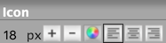
Icon
You can change the icons' size or color without affecting the text in the sharing bar.
Icon Size
- Click on the + button to make the icons larger.
- Click on the – button to make the icons smaller.
- Or click on the number to change the size of the icons.
Click on the + button to increase the size of the sharing bar's icons by 1px. Continue to click on it to increase the size by 1px per click.
Click on the – button to decrease the size of the sharing bar's icons by 1px. Continue to click on it to decrease the size by 1px per click.
Or click on the number to type in a new pixel size for the icons.
Icon Color
The default color for each icon is the standard color for that platform. If you prefer, you can make them all the same color, to suit your template's color scheme.
- Click on the Color Palette button.
-
Click on the palette to select a color. Use the rainbow slider to reach the color base you want to use in the palette.
Or enter a 6-character hex value. Or, if you've already saved colors, choose one from Your Custom Colors.
Or click on Reset to Template Default to go back to the original icon colors. - Click Set Text Color to save this selection. Click Cancel to close the tool and make no change.
Click on the Color Palette button to open the color picker overlay.
Select a color from the palette by clicking anywhere on the palette, or by dragging the small circle.
To reach the palette's color base you want (e.g., red, purple, green, etc.), click on and drag the rainbow slider.
The palette color you select appears in the square on the right.
If you know the exact color you want for the icons, type in the 6-character hex value in the text box next to the # symbol.
Enter only letters and/or numbers -- don't add the # symbol. The color you want will then appear in the square on the right, above the hex value.
If you've selected at least one custom color, you'll be able to select a color from Your Custom Colors as well.
If, after a few color selections, you decide that you don't like any of them, you can start over again by clicking on Reset to Template Default. This will give the icons their original colors.
Once you're satisfied with the color, click Set Text Color to save that selection. Or click Cancel to leave the tool without making any changes to the border color.
The default alignment is left-aligned.
Set the alignment to whatever looks best for your overall design. Remember that this setting is for the text and icons of your sharing bar.
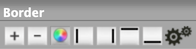
Border
You can add a border to the sharing bar, change the border's width and color, and add rounded corners to one, some or all of the corners.

Border Width
- Click on the + button to add a border and then increase the width of the border.
- Click on the – button to decrease the border width and then remove the border.
Click on the + button to add a border around all four sides, and then increase the width of the border. You cannot increase the width of an individual border.
Click on the – button to decrease the width of the border and then remove a border. You cannot decrease the width of an individual border.
The four buttons that indicate the left, right, top and bottom (discussed below) will also change. The dark edge around each button will disappear, indicating that the border has been turned off.
Border Color
- Click on the Color Palette button.
-
Click on the palette to select a color. Use the rainbow slider to reach the color base you want to use in the palette.
Or enter a 6-character hex value. Or, if you've already saved colors, choose one from Your Custom Colors.
Or click on Reset to Template Default to go back to the original border color. - Click Set Border Color to save this selection. Click Cancel to close the tool and make no change.
You can make the border stand out more by changing its color. Use a color that's part of your template's overall color scheme.
If your template is mostly green, or brown, choosing a brown or green will likely suit your colors. But hot pink or bright red would not.
Click on the Color Palette button to open the color picker overlay.
Select a color from the palette by clicking anywhere on the palette, or by dragging the small circle.
To reach the palette's color base you want (e.g., red, purple, green, etc.), click on and drag the rainbow slider.

The palette color you select appears in the square on the right.
If you know the exact color you want for the border, type in the 6-character hex value in the text box next to the # symbol.
Enter only letters and/or numbers -- don't add the # symbol. The color you want will then appear in the square on the right, above the hex value.
If you've selected at least one custom color, you'll be able to select a color from Your Custom Colors as well.
If, after a few color selections, you decide that you don't like any of them, you can start over again by clicking on Reset to Template Default. This will give the border the original color specified in the template's CSS file.
Once you're satisfied with the border color, click Set Border Color to save that selection. Or click Cancel to leave the tool without making any changes to the border color.
Borders On and Off
- Click on the left, right, top or bottom button to add or remove that part of the border.
You can have borders around all four sides of the sharing bar, around just one, or around two or three.
Keeping, or adding, the border is another way to make the sharing bar more prominent on your page.
Turn on a border, or turn an existing border off, by clicking on its button.
Advanced Styles
- Click on the gears button to open the Advanced Styles overlay.
-
Click on any of the four corner buttons to activate rounded corners for that corner.
Or click on the + button to activate all four rounded corners. - Click on the + button to increase the radius of the curve. Clock on the – button to decrease the radius.
- Click on the Revert button to remove all rounded corner styling.
- Click on any of the Style buttons to add that type of border.
- Click on the first Style button to remove any border you added.
- Click on the X in the top left to close the overlay.
You can add rounded corners to the four corners of your sharing bar using the Border advanced styles options.
You can also select the type of border you want (solid, dotted, etc.).
Rounded Corners
Your sharing bar does not need borders to round the corners, although visitors will only see the corners if you apply a border or a background color (see the Background section, below).
Click on the gears button to open the Advanced Styles overlay.
Click on any of the four rounded corner buttons to apply rounded corners to that particular corner. Or click on the + button to apply rounded corners to all of them.
Click on the + button to increase the radius (the curve) of the rounded corner(s). Click on the – button to decrease the radius.
Continue clicking on the – button to remove all the rounded corners. Or use the Revert button to remove them in one click and restore the sharing bar to its last saved state.
Border Style
You can also choose the type of border you'd like to have around your sharing bar. There are four styles to choose from, plus no border (the first button).
-
A regular solid border.
-
A dashed (broken) border.
-
A dotted border.
-
A two-line border. Note that the space between the lines is "transparent" and will show part of any color or background image beneath it.
Important
If you turn a border on using one of these buttons (instead of the + button or selecting them individually), the border starts at a thickness of three pixels.
If you turn the border on with the + button, or select them individually, the border starts at a thickness of one pixel. Increase the thickness of the border to at least two pixels (three or more is best) to see the full effect of the border.
Position
- Click on the gears button to open the Advanced Styles overlay.
- Click on the Margin Left + button to move the sharing bar to the right one pixel per click, or type in a number. Click on the Margin Right + button to move the sharing bar to the left one pixel per click, or type in a number. Click on the – button to reverse the movement.
- Click on the Margin Top + button to move the sharing bar away from the element above it, or type in a number. Click on the Margin Bottom + button to move the sharing bar away from the element below it, or type in a number. Click on the – button to reverse the movement.
- Click on the Padding Left + button to add extra space inside the sharing bar on the left, or type in a number. Click on the Padding Right + button to add extra space inside the sharing bar on the right, or type in a number. Click on the – button to reduce the space.
- Click on the Padding Top + button to add space inside the sharing bar above the labels and input fields, or type in a number. Click on the Padding Bottom + button to add space below the labels and input fields, or type in a number Click on the – button to reverse the movement.
You can also fine-tune the position of your sharing bar.
Click on the gears button to open the Advanced Styles overlay. You'll see + and – buttons for each of Margin Left, Right, Top and Bottom.
You'll also see buttons for Padding Left, Right, Top and Bottom.
Increasing the margin puts space between the sharing bar and the element next to it (to the left or right), or above or below it. Decreasing the margin reduces that space.
Increasing the padding puts space between the edge of the sharing bar and the parts inside the bar. Decreasing the padding reduces that space.
Each click of one of the buttons moves the sharing bar by one pixel. Continue clicking on that button to increase the space in the same direction.
You can also switch from pixels (px) to percentages (%). Click on px and select % from the small menu. To switch back to pixels, repeat the process.
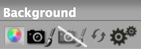
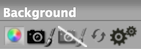
Background
The Background tools lets you change the background of the sharing bar on all pages on your site. You can change the color, upload a new background image, remove an image, or reset to your template's default image.
You also have full control over the positioning and tiling of any background image that you upload.
You can select a color for the background of your sharing bar box, or keep the background as is, with no changes.
Background Color
- Click on the Color Palette button.
-
Click on the palette to select a color. Use the rainbow slider to reach the color base you want to use in the palette.
Or enter a 6-character hex value. Or, if you've already saved colors, choose one from Your Custom Colors. You can also select Transparent.
Or click on Reset to Template Default to go back to the original background color. - Click Set Background Color to save this selection. Click Cancel to close the tool and make no change.
One way to make the sharing bar stand out is to give it a different background color from the rest of the page. You do that here.
But more important than making the text stand out is making it easy to see and read.
If you do select a different background color, ensure that there's a high contrast between the text and the color.
Black text on a white background is the easiest to read (this is the default for the sharing bar).
As you make the background color darker, ensure that you lighten the text color to keep the contrast.
Click on the Color Palette button to open the color picker overlay.
Select your color by clicking on the palette or dragging the small circle around the palette. Click on the rainbow slider to reach the desired palette of colors.
Or you can enter a 6-character hex value for the color you want to use.
You can also choose from a color in Your Custom Colors, which is available after you've selected at least one custom color in any of the color pickers. Hover over any color to see where else in your design that you've used that color.
Another option is to choose Transparent. This will make the sharing bar's background the same color as the column where you place it.
It's important to understand that if you use Transparent as the sharing bar's setting, the background could be a different color depending on where it's located.
For example, if you make the background transparent, the color could be brown in one column, white in another. If the text color for the sharing bar is a dark color, the text will not read well in the column with the dark background color.

Click on Set Background Color to save your change. The overlay window will close and your new background color will appear.
Upload Background Image
- Click on the Upload Image button.
- Click on the Browse button (Choose File if you're using Safari). Navigate to the desired background image and select it.
- Click on the Upload Background Image button.
If you would like your sharing bar to sit on something more than just a background color, you can upload an image.
Due to the size of the sharing bar (if you place it in the Content Column on a dedicated signup page), the image you upload may "tile" across the width of the sharing bar. Ensure that the image you use tiles well.
For example, a texture image may tile well, but an image with a word or words on it may not tile well, since the word(s) will be repeated across the width of the sharing bar.
Click on the Upload Image button (second from the left). This will open an overlay window...

Click on Browse (Choose File if you're using Safari) to locate the file. Click to select the file.
Click on Upload New Background Image to upload it.
The overlay window will close. You'll see the sharing bar with your new background image.
Remove Background Image
- Click on the Remove Image button.
If you added an image for the background and decide that you don't like it, use this tool to remove the image.
The background image appearing in the template will disappear, leaving you with the current background color.
Reset
- Click on the Reset button.
You can also reset all the changes you made to the background image, which restores the default image that came with your template.
This resets only the background image settings for the sharing bar.
Advanced Styles
- Click on the gears button to open the Advanced Styles overlay.
-
Click on Position V and select from Top, Center and Bottom.
And/or click on Position H and select from Left, Center and Right. -
Click on the Down arrow button to activate image tiling vertically.
Click on the Right arrow to activate image tiling horizontally. - Click again on the Down arrow button to deactivate tiling vertically. Click again on the Right arrow to deactivate tiling horizontally.
If you uploaded a background image, you have full control over it.
You can change the position of the image (Position V or Position H) or tile it down the browser window or across the window (Down arrow and Right arrow buttons).
If you upload an image that fills the entire sharing bar, use the Position options to place it exactly where you want it.
If you upload a small image, use the Down and/or Right options to tile the image to fill the sharing bar area.
Social Sharing Icons
The Social Sharing Icons bar displays only the icons of the various social platforms. So its toolbar includes options to customize the icons, the border, the position, and the background.
Icon
You can change the icons' size or color.
Icon Size
- Click on the + button to make the icons larger.
- Click on the – button to make the icons smaller.
- Or click on the number to change the size of the icons.
Click on the + button to increase the size of the sharing bar's icons by 1px. Continue to click on it to increase the size by 1px per click.
Click on the – button to decrease the size of the sharing bar's icons by 1px. Continue to click on it to decrease the size by 1px per click.
Or click on the number to type in a new pixel size for the icons.
Icon Color
The default color for each icon is the standard color for that platform. If you prefer, you can make them all the same color, to suit your template's color scheme.
- Click on the Color Palette button.
-
Click on the palette to select a color. Use the rainbow slider to reach the color base you want to use in the palette.
Or enter a 6-character hex value. Or, if you've already saved colors, choose one from Your Custom Colors.
Or click on Reset to Template Default to go back to the original icon colors. - Click Set Text Color to save this selection. Click Cancel to close the tool and make no change.
Click on the Color Palette button to open the color picker overlay.
Select a color from the palette by clicking anywhere on the palette, or by dragging the small circle.
To reach the palette's color base you want (e.g., red, purple, green, etc.), click on and drag the rainbow slider.
The palette color you select appears in the square on the right.
If you know the exact color you want for the icons, type in the 6-character hex value in the text box next to the # symbol.
Enter only letters and/or numbers -- don't add the # symbol. The color you want will then appear in the square on the right, above the hex value.
If you've selected at least one custom color, you'll be able to select a color from Your Custom Colors as well.
If, after a few color selections, you decide that you don't like any of them, you can start over again by clicking on Reset to Template Default. This will give the icons their original colors.
Once you're satisfied with the color, click Set Text Color to save that selection. Or click Cancel to leave the tool without making any changes to the border color.
Alignment
- Click on the Align Left, Align Center, or Align Right button to choose the sharing bar's alignment.
The default alignment is left-aligned.
Set the alignment to whatever looks best for your overall design. Remember that this setting is for the icons of your sharing bar.
Border
You can add a border to the sharing bar, change the border's width and color, and add rounded corners to one, some or all of the corners.
Border Width
- Click on the + button to add a border and then increase the width of the border.
- Click on the – button to decrease the border width and then remove the border.
Click on the + button to add a border around all four sides, and then increase the width of the border. You cannot increase the width of an individual border.
Click on the – button to decrease the width of the border and then remove a border. You cannot decrease the width of an individual border.
The four buttons that indicate the left, right, top and bottom (discussed below) will also change. The dark edge around each button will disappear, indicating that the border has been turned off.
Border Color
- Click on the Color Palette button.
-
Click on the palette to select a color. Use the rainbow slider to reach the color base you want to use in the palette.
Or enter a 6-character hex value. Or, if you've already saved colors, choose one from Your Custom Colors.
Or click on Reset to Template Default to go back to the original border color. - Click Set Border Color to save this selection. Click Cancel to close the tool and make no change.
You can make the border stand out more by changing its color. Use a color that's part of your template's overall color scheme.
If your template is mostly green, or brown, choosing a brown or green will likely suit your colors. But hot pink or bright red would not.
Click on the Color Palette button to open the color picker overlay.
Select a color from the palette by clicking anywhere on the palette, or by dragging the small circle.
To reach the palette's color base you want (e.g., red, purple, green, etc.), click on and drag the rainbow slider.
The palette color you select appears in the square on the right.
If you know the exact color you want for the border, type in the 6-character hex value in the text box next to the # symbol.
Enter only letters and/or numbers -- don't add the # symbol. The color you want will then appear in the square on the right, above the hex value.
If you've selected at least one custom color, you'll be able to select a color from Your Custom Colors as well.
If, after a few color selections, you decide that you don't like any of them, you can start over again by clicking on Reset to Template Default. This will give the border the original color specified in the template's CSS file.
Once you're satisfied with the border color, click Set Border Color to save that selection. Or click Cancel to leave the tool without making any changes to the border color.
Borders On and Off
- Click on the left, right, top or bottom button to add or remove that part of the border.
You can have borders around all four sides of the sharing bar, around just one, or around two or three.
Keeping, or adding, the border is another way to make the sharing bar more prominent on your page.
Turn on a border, or turn an existing border off, by clicking on its button.
Advanced Styles
- Click on the gears button to open the Advanced Styles overlay.
-
Click on any of the four corner buttons to activate rounded corners for that corner.
Or click on the + button to activate all four rounded corners. - Click on the + button to increase the radius of the curve. Clock on the – button to decrease the radius.
- Click on the Revert button to remove all rounded corner styling.
- Click on any of the Style buttons to add that type of border.
- Click on the first Style button to remove any border you added.
- Click on the X in the top left to close the overlay.
You can add rounded corners to the four corners of your sharing bar using the Border advanced styles options.
You can also select the type of border you want (solid, dotted, etc.).
Rounded Corners
Your sharing bar does not need borders to round the corners, although visitors will only see the corners if you apply a border or a background color (see the Background section, below).
Click on the gears button to open the Advanced Styles overlay.
Click on any of the four rounded corner buttons to apply rounded corners to that particular corner. Or click on the + button to apply rounded corners to all of them.
Click on the + button to increase the radius (the curve) of the rounded corner(s). Click on the – button to decrease the radius.
Continue clicking on the – button to remove all the rounded corners. Or use the Revert button to remove them in one click and restore the sharing bar to its last saved state.
Border Style
You can also choose the type of border you'd like to have around your sharing bar. There are four styles to choose from, plus no border (the first button).
-
A regular solid border.
-
A dashed (broken) border.
-
A dotted border.
-
A two-line border. Note that the space between the lines is "transparent" and will show part of any color or background image beneath it.
Important
If you turn a border on using one of these buttons (instead of the + button or selecting them individually), the border starts at a thickness of three pixels.
If you turn the border on with the + button, or select them individually, the border starts at a thickness of one pixel. Increase the thickness of the border to at least two pixels (three or more is best) to see the full effect of the border.
Position
- Click on the gears button to open the Advanced Styles overlay.
- Click on the Margin Left + button to move the sharing bar to the right one pixel per click, or type in a number. Click on the Margin Right + button to move the sharing bar to the left one pixel per click, or type in a number. Click on the – button to reverse the movement.
- Click on the Margin Top + button to move the sharing bar away from the element above it, or type in a number. Click on the Margin Bottom + button to move the sharing bar away from the element below it, or type in a number. Click on the – button to reverse the movement.
- Click on the Padding Left + button to add extra space inside the sharing bar on the left, or type in a number. Click on the Padding Right + button to add extra space inside the sharing bar on the right, or type in a number. Click on the – button to reduce the space.
- Click on the Padding Top + button to add space inside the sharing bar above the labels and input fields, or type in a number. Click on the Padding Bottom + button to add space below the labels and input fields, or type in a number Click on the – button to reverse the movement.
You can also fine-tune the position of your sharing bar.
Click on the gears button to open the Advanced Styles overlay. You'll see + and – buttons for each of Margin Left, Right, Top and Bottom.
You'll also see buttons for Padding Left, Right, Top and Bottom.
Increasing the margin puts space between the sharing bar and the element next to it (to the left or right), or above or below it. Decreasing the margin reduces that space.
Increasing the padding puts space between the edge of the sharing bar and the parts inside the bar. Decreasing the padding reduces that space.
Each click of one of the buttons moves the sharing bar by one pixel. Continue clicking on that button to increase the space in the same direction.
You can also switch from pixels (px) to percentages (%). Click on px and select % from the small menu. To switch back to pixels, repeat the process.
Background
The Background tools lets you change the background of the sharing bar on all pages on your site. You can change the color, upload a new background image, remove an image, or reset to your template's default image.
You also have full control over the positioning and tiling of any background image that you upload.
You can select a color for the background of your sharing bar box, or keep the background as is, with no changes.
Background Color
- Click on the Color Palette button.
-
Click on the palette to select a color. Use the rainbow slider to reach the color base you want to use in the palette.
Or enter a 6-character hex value. Or, if you've already saved colors, choose one from Your Custom Colors. You can also select Transparent.
Or click on Reset to Template Default to go back to the original background color. - Click Set Background Color to save this selection. Click Cancel to close the tool and make no change.
One way to make the sharing bar stand out is to give it a different background color from the rest of the page. You do that here.
But more important than making the text stand out is making it easy to see and read.
If you do select a different background color, ensure that there's a high contrast between the text and the color.
Black text on a white background is the easiest to read (this is the default for the sharing bar).
As you make the background color darker, ensure that you lighten the text color to keep the contrast.
Click on the Color Palette button to open the color picker overlay.
Select your color by clicking on the palette or dragging the small circle around the palette. Click on the rainbow slider to reach the desired palette of colors.
Or you can enter a 6-character hex value for the color you want to use.
You can also choose from a color in Your Custom Colors, which is available after you've selected at least one custom color in any of the color pickers. Hover over any color to see where else in your design that you've used that color.
Another option is to choose Transparent. This will make the sharing bar's background the same color as the column where you place it.
It's important to understand that if you use Transparent as the sharing bar's setting, the background could be a different color depending on where it's located.
For example, if you make the background transparent, the color could be brown in one column, white in another. If the text color for the destinations bar is a dark color, the text will not read well in the column with the dark background color.
Click on Set Background Color to save your change. The overlay window will close and your new background color will appear.
Upload Background Image
- Click on the Upload Image button.
- Click on the Browse button (Choose File if you're using Safari). Navigate to the desired background image and select it.
- Click on the Upload Background Image button.
If you would like your sharing bar to sit on something more than just a background color, you can upload an image.
Due to the size of the sharing bar (if you place it in the Content Column on a dedicated signup page), the image you upload may "tile" across the width of the sharing bar. Ensure that the image you use tiles well.
For example, a texture image may tile well, but an image with a word or words on it may not tile well, since the word(s) will be repeated across the width of the sharing bar.
Click on the Upload Image button (second from the left). This will open an overlay window...
Click on Browse (Choose File if you're using Safari) to locate the file. Click to select the file.
Click on Upload New Background Image to upload it.
The overlay window will close. You'll see the sharing bar with your new background image.
Remove Background Image
- Click on the Remove Image button.
If you added an image for the background and decide that you don't like it, use this tool to remove the image.
The background image appearing in the template will disappear, leaving you with the current background color.
Reset
- Click on the Reset button.
You can also reset all the changes you made to the background image, which restores the default image that came with your template.
This resets only the background image settings for the sharing bar.
Advanced Styles
- Click on the gears button to open the Advanced Styles overlay.
-
Click on Position V and select from Top, Center and Bottom.
And/or click on Position H and select from Left, Center and Right. -
Click on the Down arrow button to activate image tiling vertically.
Click on the Right arrow to activate image tiling horizontally. - Click again on the Down arrow button to deactivate tiling vertically. Click again on the Right arrow to deactivate tiling horizontally.
If you uploaded a background image, you have full control over it.
You can change the position of the image (Position V or Position H) or tile it down the browser window or across the window (Down arrow and Right arrow buttons).
If you upload an image that fills the entire sharing bar, use the Position options to place it exactly where you want it.
If you upload a small image, use the Down and/or Right options to tile the image to fill the sharing bar area.
Sharing Bar Sticky
The Social Sharing Sticky bar displays only the icons of the various social platforms, and displays them vertically on the left or right edge of the page, or at the top or bottom of the page. The bar is "sticky," which means that as your visitor scrolls down the page, the bar does not move.
Its toolbar includes options to customize the icons, the border, the position, and the background.

Icon
You can change the icons' size, color, alignment.
You can also change the letter spacing for the word "Share," if you include it at the top of the bar.
Icon Size
- Click on the + button to make the icons larger.
- Click on the – button to make the icons smaller.
- Or click on the number to change the size of the icons.
While you can make the icons larger, keep in mind that the larger they are, the farther to the right (if sticking to the left) or to the left (if sticking to the right) they will display.
This means that the icons could start to overlap the content of the page. If that happens, either decrease the icon size, or use the Position options to add margin, which will push the text away from the sharing bar.
This is not important if you plan to stick the bar to the top or bottom of the page.
Click on the + button to increase the size of the sharing bar's icons by 1px. Continue to click on it to increase the size by 1px per click.
Click on the – button to decrease the size of the sharing bar's icons by 1px. Continue to click on it to decrease the size by 1px per click.
Or click on the number to type in a new pixel size for the icons.
Icon Color
The default color for each icon is the standard color for that platform. If you prefer, you can make them all the same color, to suit your template's color scheme.
- Click on the Color Palette button.
-
Click on the palette to select a color. Use the rainbow slider to reach the color base you want to use in the palette.
Or enter a 6-character hex value. Or, if you've already saved colors, choose one from Your Custom Colors.
Or click on Reset to Template Default to go back to the original icon colors. - Click Set Text Color to save this selection. Click Cancel to close the tool and make no change.
Click on the Color Palette button to open the color picker overlay.
Select a color from the palette by clicking anywhere on the palette, or by dragging the small circle.
To reach the palette's color base you want (e.g., red, purple, green, etc.), click on and drag the rainbow slider.
The palette color you select appears in the square on the right.
If you know the exact color you want for the icons, type in the 6-character hex value in the text box next to the # symbol.
Enter only letters and/or numbers -- don't add the # symbol. The color you want will then appear in the square on the right, above the hex value.
If you've selected at least one custom color, you'll be able to select a color from Your Custom Colors as well.
If, after a few color selections, you decide that you don't like any of them, you can start over again by clicking on Reset to Template Default. This will give the icons their original colors.
Once you're satisfied with the color, click Set Text Color to save that selection. Or click Cancel to leave the tool without making any changes to the border color.
Icon Alignment
The Sticky bar attaches to the left or right side of your pages. The default alignment is center inside the space allotted to the bar.
If you stick the bar to the right side, set the alignment to center or right. If you stick the bar to the left side, set the alignment to center or left.
This will ensure that the bar takes up as little room on the page as possible.
Icon Advanced Options
If you choose to add the word "Share" to the top of the bar, you can increase or decrease the spacing between the letters.
Click the + button to increase the spacing. Click the – button to decrease the spacing.
Click the button with two curved arrows to reset the spacing to the default.
Border
You can add a border to the sharing bar, change the border's width and color, and add rounded corners to one, some or all of the corners.

Border Width
- Click on the + button to add a border and then increase the width of the border.
- Click on the – button to decrease the border width and then remove the border.
Click on the + button to add a border around all four sides, and then increase the width of the border. You cannot increase the width of an individual border.
Click on the – button to decrease the width of the border and then remove a border. You cannot decrease the width of an individual border.
The four buttons that indicate the left, right, top and bottom (discussed below) will also change. The dark edge around each button will disappear, indicating that the border has been turned off.
Border Color
- Click on the Color Palette button.
-
Click on the palette to select a color. Use the rainbow slider to reach the color base you want to use in the palette.
Or enter a 6-character hex value. Or, if you've already saved colors, choose one from Your Custom Colors.
Or click on Reset to Template Default to go back to the original border color. - Click Set Border Color to save this selection. Click Cancel to close the tool and make no change.
You can make the border stand out more by changing its color. Use a color that's part of your template's overall color scheme.
If your template is mostly green, or brown, choosing a brown or green will likely suit your colors. But hot pink or bright red would not.
Click on the Color Palette button to open the color picker overlay.
Select a color from the palette by clicking anywhere on the palette, or by dragging the small circle.
To reach the palette's color base you want (e.g., red, purple, green, etc.), click on and drag the rainbow slider.
The palette color you select appears in the square on the right.
If you know the exact color you want for the border, type in the 6-character hex value in the text box next to the # symbol.
Enter only letters and/or numbers -- don't add the # symbol. The color you want will then appear in the square on the right, above the hex value.
If you've selected at least one custom color, you'll be able to select a color from Your Custom Colors as well.
If, after a few color selections, you decide that you don't like any of them, you can start over again by clicking on Reset to Template Default. This will give the border the original color specified in the template's CSS file.
Once you're satisfied with the border color, click Set Border Color to save that selection. Or click Cancel to leave the tool without making any changes to the border color.
Borders On and Off
- Click on the left, right, top or bottom button to add or remove that part of the border.
You can have borders around all four sides of the sharing bar, around just one, or around two or three.
Keeping, or adding, the border is another way to make the sharing bar more prominent on your page.
Turn on a border, or turn an existing border off, by clicking on its button.
Advanced Styles
- Click on the gears button to open the Advanced Styles overlay.
-
Click on any of the four corner buttons to activate rounded corners for that corner.
Or click on the + button to activate all four rounded corners. - Click on the + button to increase the radius of the curve. Clock on the – button to decrease the radius.
- Click on the Revert button to remove all rounded corner styling.
- Click on any of the Style buttons to add that type of border.
- Click on the first Style button to remove any border you added.
- Click on the X in the top left to close the overlay.
You can add rounded corners to the four corners of your sharing bar using the Border advanced styles options.
You can also select the type of border you want (solid, dotted, etc.).
Rounded Corners
Your sharing bar does not need borders to round the corners, although visitors will only see the corners if you apply a border or a background color (see the Background section, below).
Click on the gears button to open the Advanced Styles overlay.
Click on any of the four rounded corner buttons to apply rounded corners to that particular corner. Or click on the + button to apply rounded corners to all of them.
Click on the + button to increase the radius (the curve) of the rounded corner(s). Click on the – button to decrease the radius.
Continue clicking on the – button to remove all the rounded corners. Or use the Revert button to remove them in one click and restore the sharing bar to its last saved state.
Border Style
You can also choose the type of border you'd like to have around your sharing bar. There are four styles to choose from, plus no border (the first button).
-
A regular solid border.
-
A dashed (broken) border.
-
A dotted border.
-
A two-line border. Note that the space between the lines is "transparent" and will show part of any color or background image beneath it.
Important
If you turn a border on using one of these buttons (instead of the + button or selecting them individually), the border starts at a thickness of three pixels.
If you turn the border on with the + button, or select them individually, the border starts at a thickness of one pixel. Increase the thickness of the border to at least two pixels (three or more is best) to see the full effect of the border.
Position
- Click on the gears button to open the Advanced Styles overlay.
- Click on the Margin Left + button to move the sharing bar to the right one pixel per click, or type in a number. Click on the Margin Right + button to move the sharing bar to the left one pixel per click, or type in a number. Click on the – button to reverse the movement.
- Click on the Margin Top + button to move the sharing bar away from the element above it, or type in a number. Click on the Margin Bottom + button to move the sharing bar away from the element below it, or type in a number. Click on the – button to reverse the movement.
- Click on the Padding Left + button to add extra space inside the sharing bar on the left, or type in a number. Click on the Padding Right + button to add extra space inside the sharing bar on the right, or type in a number. Click on the – button to reduce the space.
- Click on the Padding Top + button to add space inside the sharing bar above the labels and input fields, or type in a number. Click on the Padding Bottom + button to add space below the labels and input fields, or type in a number Click on the – button to reverse the movement.
You can also fine-tune the position of your sharing bar.
Click on the gears button to open the Advanced Styles overlay. You'll see + and – buttons for each of Margin Left, Right, Top and Bottom.
You'll also see buttons for Padding Left, Right, Top and Bottom.
Increasing the margin puts space between the sharing bar and the element next to it (to the left or right), or above or below it. Decreasing the margin reduces that space.
Increasing the padding puts space between the edge of the sharing bar and the parts inside the bar. Decreasing the padding reduces that space.
Each click of one of the buttons moves the sharing bar by one pixel. Continue clicking on that button to increase the space in the same direction.
You can also switch from pixels (px) to percentages (%). Click on px and select % from the small menu. To switch back to pixels, repeat the process.
Background
The Background tools lets you change the background of the sharing bar on all pages on your site. You can change the color, upload a new background image, remove an image, or reset to your template's default image.
You also have full control over the positioning and tiling of any background image that you upload.
You can select a color for the background of your sharing bar box, or keep the background as is, with no changes.
Background Color
- Click on the Color Palette button.
-
Click on the palette to select a color. Use the rainbow slider to reach the color base you want to use in the palette.
Or enter a 6-character hex value. Or, if you've already saved colors, choose one from Your Custom Colors. You can also select Transparent.
Or click on Reset to Template Default to go back to the original background color. - Click Set Background Color to save this selection. Click Cancel to close the tool and make no change.
One way to make the sharing bar stand out is to give it a different background color from the rest of the page. You do that here.
But more important than making the text stand out is making it easy to see and read.
If you do select a different background color, ensure that there's a high contrast between the text and the color.
Black text on a white background is the easiest to read (this is the default for the sharing bar).
As you make the background color darker, ensure that you lighten the text color to keep the contrast.
Click on the Color Palette button to open the color picker overlay.
Select your color by clicking on the palette or dragging the small circle around the palette. Click on the rainbow slider to reach the desired palette of colors.
Or you can enter a 6-character hex value for the color you want to use.
You can also choose from a color in Your Custom Colors, which is available after you've selected at least one custom color in any of the color pickers. Hover over any color to see where else in your design that you've used that color.
Another option is to choose Transparent. This will make the sharing bar's background the same color as the column where you place it.
It's important to understand that if you use Transparent as the sharing bar's setting, the background could be a different color depending on where it's located.
For example, if you make the background transparent, the color could be brown in one column, white in another. If the text color for the destinations bar is a dark color, the text will not read well in the column with the dark background color.
Click on Set Background Color to save your change. The overlay window will close and your new background color will appear.
Upload Background Image
- Click on the Upload Image button.
- Click on the Browse button (Choose File if you're using Safari). Navigate to the desired background image and select it.
- Click on the Upload Background Image button.
If you would like your sharing bar to sit on something more than just a background color, you can upload an image.
Due to the size of the sharing bar (if you place it in the Content Column on a dedicated signup page), the image you upload may "tile" across the width of the sharing bar. Ensure that the image you use tiles well.
For example, a texture image may tile well, but an image with a word or words on it may not tile well, since the word(s) will be repeated across the width of the sharing bar.
Click on the Upload Image button (second from the left). This will open an overlay window...
Click on Browse (Choose File if you're using Safari) to locate the file. Click to select the file.
Click on Upload New Background Image to upload it.
The overlay window will close. You'll see the sharing bar with your new background image.
Remove Background Image
- Click on the Remove Image button.
If you added an image for the background and decide that you don't like it, use this tool to remove the image.
The background image appearing in the template will disappear, leaving you with the current background color.
Reset
- Click on the Reset button.
You can also reset all the changes you made to the background image, which restores the default image that came with your template.
This resets only the background image settings for the sharing bar.
Advanced Styles
- Click on the gears button to open the Advanced Styles overlay.
-
Click on Position V and select from Top, Center and Bottom.
And/or click on Position H and select from Left, Center and Right. -
Click on the Down arrow button to activate image tiling vertically.
Click on the Right arrow to activate image tiling horizontally. - Click again on the Down arrow button to deactivate tiling vertically. Click again on the Right arrow to deactivate tiling horizontally.
If you uploaded a background image, you have full control over it.
You can change the position of the image (Position V or Position H) or tile it down the browser window or across the window (Down arrow and Right arrow buttons).
If you upload an image that fills the entire sharing bar, use the Position options to place it exactly where you want it.
If you upload a small image, use the Down and/or Right options to tile the image to fill the sharing bar area.
Social Destinations
The Social Destinations bar is a set of icons that let your site visitors go to your social media accounts so that they can like or follow those accounts.
Setting up the destination URLs occurs in Socialize It!, and adding them to your pages happens in BB2.

Icon
You can change the icons' size or color. You can also change the alignment of the destinations bar.
Icon Size
- Click on the + button to make the icons larger.
- Click on the – button to make the icons smaller.
- Or click on the number to change the size of the icons.
Click on the + button to increase the size of the destinations bar's icons by 1px. Continue to click on it to increase the size by 1px per click.
Click on the – button to decrease the size of the destinations bar's icons by 1px. Continue to click on it to decrease the size by 1px per click.
Or click on the number to type in a new pixel size for the icons.
Icon Color
By default, the destinations bar icons take the color you set for your footer's text links. You can select a different color, if desired.
- Click on the Color Palette button.
-
Click on the palette to select a color. Use the rainbow slider to reach the color base you want to use in the palette.
Or enter a 6-character hex value. Or, if you've already saved colors, choose one from Your Custom Colors.
Or click on Reset to Template Default to go back to the original icon colors. - Click Set Text Color to save this selection. Click Cancel to close the tool and make no change.
Click on the Color Palette button to open the color picker overlay.
Select a color from the palette by clicking anywhere on the palette, or by dragging the small circle.
To reach the palette's color base you want (e.g., red, purple, green, etc.), click on and drag the rainbow slider.
The palette color you select appears in the square on the right.
If you know the exact color you want for the icons, type in the 6-character hex value in the text box next to the # symbol.
Enter only letters and/or numbers -- don't add the # symbol. The color you want will then appear in the square on the right, above the hex value.
If you've selected at least one custom color, you'll be able to select a color from Your Custom Colors as well.
If, after a few color selections, you decide that you don't like any of them, you can start over again by clicking on Reset to Template Default. This will give the icons their original colors.
Once you're satisfied with the color, click Set Text Color to save that selection. Or click Cancel to leave the tool without making any changes to the border color.
Alignment
- Click on the Align Left, Align Center, or Align Right button to choose the destinations bar's alignment.
The destination bar's default alignment is centered.
Set the alignment to whatever looks best for your overall design. Remember that this setting is for your destinations bar, not the icons inside the bar.
Border
You can add a border to the destinations bar, change the border's width and color, and add rounded corners to one, some or all of the corners.
Border Width
- Click on the + button to add a border and then increase the width of the border.
- Click on the – button to decrease the border width and then remove the border.
Click on the + button to add a border around all four sides, and then increase the width of the border. You cannot increase the width of an individual border.
Click on the – button to decrease the width of the border and then remove a border. You cannot decrease the width of an individual border.
The four buttons that indicate the left, right, top and bottom (discussed below) will also change. The dark edge around each button will disappear, indicating that the border has been turned off.
Border Color
- Click on the Color Palette button.
-
Click on the palette to select a color. Use the rainbow slider to reach the color base you want to use in the palette.
Or enter a 6-character hex value. Or, if you've already saved colors, choose one from Your Custom Colors.
Or click on Reset to Template Default to go back to the original border color. - Click Set Border Color to save this selection. Click Cancel to close the tool and make no change.
You can make the border stand out more by changing its color. Use a color that's part of your template's overall color scheme.
If your template is mostly green, or brown, choosing a brown or green will likely suit your colors. But hot pink or bright red would not.
Click on the Color Palette button to open the color picker overlay.
Select a color from the palette by clicking anywhere on the palette, or by dragging the small circle.
To reach the palette's color base you want (e.g., red, purple, green, etc.), click on and drag the rainbow slider.
The palette color you select appears in the square on the right.
If you know the exact color you want for the border, type in the 6-character hex value in the text box next to the # symbol.
Enter only letters and/or numbers -- don't add the # symbol. The color you want will then appear in the square on the right, above the hex value.
If you've selected at least one custom color, you'll be able to select a color from Your Custom Colors as well.
If, after a few color selections, you decide that you don't like any of them, you can start over again by clicking on Reset to Template Default. This will give the border the original color specified in the template's CSS file.
Once you're satisfied with the border color, click Set Border Color to save that selection. Or click Cancel to leave the tool without making any changes to the border color.
Borders On and Off
- Click on the left, right, top or bottom button to add or remove that part of the border.
You can have borders around all four sides of the destinations bar, around just one, or around two or three.
Keeping, or adding, the border is another way to make the destinations bar more prominent on your page.
Turn on a border, or turn an existing border off, by clicking on its button.
Advanced Styles
- Click on the gears button to open the Advanced Styles overlay.
-
Click on any of the four corner buttons to activate rounded corners for that corner.
Or click on the + button to activate all four rounded corners. - Click on the + button to increase the radius of the curve. Clock on the – button to decrease the radius.
- Click on the Revert button to remove all rounded corner styling.
- Click on any of the Style buttons to add that type of border.
- Click on the first Style button to remove any border you added.
- Click on the X in the top left to close the overlay.
You can add rounded corners to the four corners of your destinations bar using the Border advanced styles options.
You can also select the type of border you want (solid, dotted, etc.).
Rounded Corners
Your destinations bar does not need borders to round the corners, although visitors will only see the corners if you apply a border or a background color (see the Background section, below).
Click on the gears button to open the Advanced Styles overlay.
Click on any of the four rounded corner buttons to apply rounded corners to that particular corner. Or click on the + button to apply rounded corners to all of them.
Click on the + button to increase the radius (the curve) of the rounded corner(s). Click on the – button to decrease the radius.
Continue clicking on the – button to remove all the rounded corners. Or use the Revert button to remove them in one click and restore the destinations bar to its last saved state.
Border Style
You can also choose the type of border you'd like to have around your destinations bar. There are four styles to choose from, plus no border (the first button).
-
A regular solid border.
-
A dashed (broken) border.
-
A dotted border.
-
A two-line border. Note that the space between the lines is "transparent" and will show part of any color or background image beneath it.
Important
If you turn a border on using one of these buttons (instead of the + button or selecting them individually), the border starts at a thickness of three pixels.
If you turn the border on with the + button, or select them individually, the border starts at a thickness of one pixel. Increase the thickness of the border to at least two pixels (three or more is best) to see the full effect of the border.
Position
- Click on the gears button to open the Advanced Styles overlay.
- Click on the Margin Left + button to move the destinations bar to the right one pixel per click, or type in a number. Click on the Margin Right + button to move the destinations bar to the left one pixel per click, or type in a number. Click on the – button to reverse the movement.
- Click on the Margin Top + button to move the destinations bar away from the element above it, or type in a number. Click on the Margin Bottom + button to move the destinations bar away from the element below it, or type in a number. Click on the – button to reverse the movement.
- Click on the Padding Left + button to add extra space inside the destinations bar on the left, or type in a number. Click on the Padding Right + button to add extra space inside the destinations bar on the right, or type in a number. Click on the – button to reduce the space.
- Click on the Padding Top + button to add space inside the destinations bar above the labels and input fields, or type in a number. Click on the Padding Bottom + button to add space below the labels and input fields, or type in a number Click on the – button to reverse the movement.
You can also fine-tune the position of your destinations bar.
Click on the gears button to open the Advanced Styles overlay. You'll see + and – buttons for each of Margin Left, Right, Top and Bottom.
You'll also see buttons for Padding Left, Right, Top and Bottom.
Increasing the margin puts space between the destinations bar and the element next to it (to the left or right), or above or below it. Decreasing the margin reduces that space.
Increasing the padding puts space between the edge of the destinations bar and the parts inside the bar. Decreasing the padding reduces that space.
Each click of one of the buttons moves the destinations bar by one pixel. Continue clicking on that button to increase the space in the same direction.
You can also switch from pixels (px) to percentages (%). Click on px and select % from the small menu. To switch back to pixels, repeat the process.
Background
The Background tools lets you change the background of the destinations bar on all pages on your site. You can change the color, upload a new background image, remove an image, or reset to your template's default image.
You also have full control over the positioning and tiling of any background image that you upload.
You can select a color for the background of your destinations bar box, or keep the background as is, with no changes.
Background Color
- Click on the Color Palette button.
-
Click on the palette to select a color. Use the rainbow slider to reach the color base you want to use in the palette.
Or enter a 6-character hex value. Or, if you've already saved colors, choose one from Your Custom Colors. You can also select Transparent.
Or click on Reset to Template Default to go back to the original background color. - Click Set Background Color to save this selection. Click Cancel to close the tool and make no change.
One way to make the destinations bar stand out is to give it a different background color from the rest of the page. You do that here.
But more important than making the text stand out is making it easy to see and read.
If you do select a different background color, ensure that there's a high contrast between the text and the color.
Black text on a white background is the easiest to read (this is the default for the destinations bar).
As you make the background color darker, ensure that you lighten the text color to keep the contrast.
Click on the Color Palette button to open the color picker overlay.
Select your color by clicking on the palette or dragging the small circle around the palette. Click on the rainbow slider to reach the desired palette of colors.
Or you can enter a 6-character hex value for the color you want to use.
You can also choose from a color in Your Custom Colors, which is available after you've selected at least one custom color in any of the color pickers. Hover over any color to see where else in your design that you've used that color.
Another option is to choose Transparent. This will make the destinations bar's background the same color as the column where you place it.
It's important to understand that if you use Transparent as the destinations bar's setting, the background could be a different color depending on where it's located.
For example, if you make the background transparent, the color could be brown in one column, white in another. If the text color for the destinations bar is a dark color, the text will not read well in the column with the dark background color.
Click on Set Background Color to save your change. The overlay window will close and your new background color will appear.
Upload Background Image
- Click on the Upload Image button.
- Click on the Browse button (Choose File if you're using Safari). Navigate to the desired background image and select it.
- Click on the Upload Background Image button.
If you would like your destinations bar to sit on something more than just a background color, you can upload an image.
Due to the size of the destinations bar (if you place it in the Content Column on a dedicated signup page), the image you upload may "tile" across the width of the destinations bar. Ensure that the image you use tiles well.
For example, a texture image may tile well, but an image with a word or words on it may not tile well, since the word(s) will be repeated across the width of the destinations bar.
Click on the Upload Image button (second from the left). This will open an overlay window...
Click on Browse (Choose File if you're using Safari) to locate the file. Click to select the file.
Click on Upload New Background Image to upload it.
The overlay window will close. You'll see the destinations bar with your new background image.
Remove Background Image
- Click on the Remove Image button.
If you added an image for the background and decide that you don't like it, use this tool to remove the image.
The background image appearing in the template will disappear, leaving you with the current background color.
Reset
- Click on the Reset button.
You can also reset all the changes you made to the background image, which restores the default image that came with your template.
This resets only the background image settings for the destinations bar.
Advanced Styles
- Click on the gears button to open the Advanced Styles overlay.
-
Click on Position V and select from Top, Center and Bottom.
And/or click on Position H and select from Left, Center and Right. -
Click on the Down arrow button to activate image tiling vertically.
Click on the Right arrow to activate image tiling horizontally. - Click again on the Down arrow button to deactivate tiling vertically. Click again on the Right arrow to deactivate tiling horizontally.
If you uploaded a background image, you have full control over it.
You can change the position of the image (Position V or Position H) or tile it down the browser window or across the window (Down arrow and Right arrow buttons).
If you upload an image that fills the entire destinations bar, use the Position options to place it exactly where you want it.
If you upload a small image, use the Down and/or Right options to tile the image to fill the destinations bar area.