
Styling the Responsive Grid Block
Contents
Styling the Responsive Grid Block
The Grid Block is responsive. It will alter to fit the width of whatever device (desktop, laptop, tablet or mobile phone) a visitor is using to view your site.
For example, the Site Designer default for the desktop is 6 columns and 2 rows. (You select the number of columns and rows you want for a grid on the page you're building in BlockBuilder.)
Depending on the width of the device screen, some cells in the block will drop down to the next "line" and display there.
Compare the two screenshots below, one for the desktop (6 x 2) and one for the Portrait orientation of an iPad (3 x 4)...
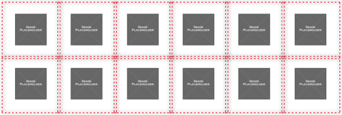
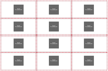
This is done automatically by Solo Build It! depending on the device viewing the page with the Responsive Grid Block content.
Your task here is to set the padding (the white space) between the cells in the block.

Padding Top
- Click on the + button to increase the white space at the top of each dummy image. Click on the – button to decrease the white space.
- Or click on the number to open an edit box. Highlight the number and change it to the padding you want at the top of the grid.
- Click on "px" or the small triangles to select percentage. Repeat to switch back to pixels.
- Check each device, in Portrait and Landscape orientation, to ensure that the white space is how you want it.
Padding Top lets you add more white space above the content of each cell, or remove some.
Use the + and – buttons to increase or decrease the padding. Or click on the number to open an edit box. Highlight the number, then change it to the padding you want.
Click on px to select the percentage option. Click again to select the px option.
This tool works independently for each device, so check each one to ensure that padding is how you want it.
Padding Right
- Click on the + button to increase the white space on the right of each dummy image. Click on the – button to decrease the white space.
- Or click on the number to open an edit box. Highlight the number and change it to the padding you want at the top of the grid.
- Click on "px" or the small triangles to select percentage. Repeat to switch back to pixels.
- Check each device, in Portrait and Landscape orientation, to ensure that the white space is how you want it.
Padding Right lets you add more white space to the right of the content in each cell, or remove some.
Use the + and – buttons to increase or decrease the padding. Or click on the number to open an edit box. Highlight the number, then change it to the padding you want.
Click on px to select the percentage option. It's best to use percentages so that the white space adjusts to the width of the viewport in mobile devices. Click again to select the px option.
This tool works independently for each device, so check each one to ensure that padding is how you want it.
Padding Bottom
- Click on the + button to increase the white space at the bottom of each dummy image. Click on the – button to decrease the white space.
- Or click on the number to open an edit box. Highlight the number and change it to the padding you want at the top of the grid.
- Click on "px" or the small triangles to select percentage. Repeat to switch back to pixels.
- Check each device, in Portrait and Landscape orientation, to ensure that the white space is how you want it.
Padding Bottom lets you add more white space below the content of each cell, or remove some.
Use the + and – buttons to increase or decrease the padding. Or click on the number to open an edit box. Highlight the number, then change it to the padding you want.
Click on px to select the percentage option. Click again to select the px option.
This tool works independently for each device, so check each one to ensure that padding is how you want it.
Padding Left
- Click on the + button to increase the white space on the left of each dummy image. Click on the – button to decrease the white space.
- Or click on the number to open an edit box. Highlight the number and change it to the padding you want at the top of the grid.
- Click on "px" or the small triangles to select percentage. Repeat to switch back to pixels.
- Check each device, in Portrait and Landscape orientation, to ensure that the white space is how you want it.
Padding Left lets you add more white space to the left of the content in each cell, or remove some.
Use the + and – buttons to increase or decrease the padding. Or click on the number to open an edit box. Highlight the number, then change it to the padding you want.
Click on px to select the percentage option. It's best to use percentages so that the white space adjusts to the width of the viewport in mobile devices. Click again to select the px option.
This tool works independently for each device, so check each one to ensure that padding is how you want it.