
Styling the Callout Box
Contents
Styling the Callout Box
The Callout Box editor is where you make changes that affect all the callout boxes on your pages.
Below is a screenshot of the toolbar for the Callout Box...

If you're ever unsure what a button does, hover over it for a second. Its function will appear as a tooltip.
When you're done designing your Callout Box, you can add them to your pages using the Container Block in BlockBuilder. Read the Container Block help for a discussion of the Callout Box, what it is and when to use it.
Text
With the Text tools, you can customize the following for all the Callout Box text...
-
font type
-
font size
-
bold and italic
-
text color
-
text alignment
You can also customize other options by opening the Advanced Styles overlay.
Font Picker
- Click on the A button.
-
Click on a tab to review the fonts available to you. Hover over a font to preview it. Click on a font to select it.
Or click on Reset to Template Default to return to the default font. - Click on Set Font to save this selection, Cancel to close the tool and make no change.
Click on the A button to change the font of your text. An overlay window opens on top of your template.
Click on a tab to see the fonts in that type of font. Be sure to scroll down to see the entire list. These font categories include...
-
Sans Serif (Arial, Verdana, etc.)
-
Monospace (Courier, etc.)
-
Serif (Palatino, Georgia, etc.)
-
Display (many of these make good headline fonts)
-
Handwriting (handwriting and printing fonts)
- System Fonts (web-safe fonts from the Sans Serif, Serif and Monospace categories)
Preview each font by hovering over its name and viewing the preview text.
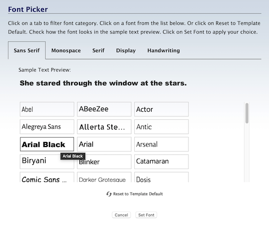
Select the font you want to use. It will now have a red border.
Click on Set Font to save your selection.
The overlay window will close and all the Callout Box's text will immediately appear with the selected font.
The system fonts load faster, and will create fewer reports (if any) in the Core Web Vitals section of Google Search Console and PageSpeed Insights.
The remaining fonts are Google fonts. They often look better than the system fonts, but they come at a price of issues that you may have to fix after you've published a few pages.
Font Size
- Click on the + button to increase the size of the text. Click on the – button to decrease the text size.
- Or click on the number to open the edit box. Double-click on the number and type in the new size.
While it's important to make the font size big enough for your target audience to read, it could be slightly smaller than the main text.
Or, if you want to make it seem more important, make it slightly bigger than the main text size.
Click on the + button to make the text larger, or click on the – button to make it smaller.
The callout text will immediately appear in a different size (one pixel bigger or smaller, per click) in the template. The size indicator will also change to the current pixel size.
Click on that button again to continue increasing or decreasing the font size. The size indicator will continue to change.
You can also click on the current size number (in the screenshot below, 15). This opens a small edit box. Double-click on the number to highlight it, then type in the size you want. Click anywhere in the toolbar to close the box. You'll see your new number there, and the text will display in that new size.
Bold and Italic
- Click on the B button to add bold to the callout text.
- Click on the I button to italicize the text.
Since callout text is usually short, you may want to have it stand out by making it all bold.
However, that means that you can't use bold to emphasize certain parts of the callout text.
Adding italics (the I button) to the text is another good way to make it look different than the other text on the page.
Highlight text and click on the B button to make the text bold.
Highlight text and click on the I button to italicize text.
Bold and italic can be combined (click on both buttons) to have text that looks like this.
Text Color
- Click on the Color Palette button to open the color picker.
-
Select a color from the palette. Click on the rainbow slider to choose another color base for the palette.
Or enter a 6-character hex value. Or, if you've already saved colors, choose one from Your Custom Colors.
Or click on Reset to Template Default to go back to the original text color. - Click Set Text Color to save this selection. Click Cancel to close the tool and make no change.
The color of your callout text should suit the overall look of your template.
But, more importantly, it needs to provide a good user experience for your readers. That means making it a high contrast color.
Black text on a white background is by far the easiest to read online, as that's what we're accustomed to reading offline. Dark gray on white is almost as good.
Using a dark shade of a color on a lighter shade of the same color will make your content hard to read.
White on black tends to be harder to read as well, although many sites directed towards younger audiences use this to good effect.
The most important factor here is readability. Choose a font color that your audience can read easily. If that means selecting black over a color that might fit the color scheme of your site, go with black.
Click on the Color Palette button. This opens an overlay window with the color picker.
Select the color you want from the palette, enter a 6-character hex value, or select a color from Your Custom Colors.

You can also go back to the original color in your template by clicking on Reset to Template Default.
Click on Set Text Color to save your selection. The overlay window will close. You'll see the callout text with this color change.
Tips
-
The color inside the small circle is indicated in the hex value box. Alternately, entering a 6-character hex value changes the location of the small circle inside the palette.
-
Dragging the slider in the rainbow column leaves the small circle in the same position on the palette, as the colors change beneath it.
-
As you set colors in the various color pickers (text, border, background), those colors are added to the "crayon box" (called Your Custom Colors) for easy access when editing other parts of your template. Use Your Custom Colors to create a color scheme for your site.
Alignment
- Click on the Align Left, Align Center, Align Right or Justify button to choose the text alignment.
The default alignment for the templates is left-aligned. That alignment makes for the easiest on-screen reading.
Why? Because it gives readers a standard left edge while also providing useful "end-of-line" cues to help them move from one line to the next.
This is a time when Justify could be a good option. Since callout text is usually short, having justified right line endings can make the text stand out more without affecting the overall user experience.
Advanced Styles
- Click on the gears button to open the Advanced Styles overlay.
- Adjust the letter spacing, word spacing and line height. Use the font variant and text transform, if desired.
- Click on the x in the top left corner of the overlay to close it.
Advanced Styles for text allow you to change various options for how the callout text appears on your pages.
Letter Spacing lets you add or remove space between the letters in every word in every Callout Box on every page of your site.
Click on the + button to add space, and the – button to remove space. Or click on the Revert button to go back to the default spacing.
Word Spacing lets you add or remove space between every word in every Callout Box on every page of your site.
Click on the + button to add space, and the – button to remove space. Or click on the Revert button to go back to the default spacing.
Line Height lets you add or remove space between every line in every Callout Box on every page of your site.
Click on the + button to increase the line height, and the – button to decrease it. Or click on the Revert button to go back to the default line height.
Font Variant lets you switch to an ALL CAPS version of your font. Any letter that would normally be capitalized has a slightly larger height than the "lowercase" letters.
Text Transform lets you set each word to start with a Capitalized Letter, or have every word start with a lower text letter, or make every letter a CAPITAL.
When you're done, click on the x in the top left corner of the overlay to close it and return to the Site Designer main toolbar.
Border
You can add (or remove) the border or parts of a border around the Callout Box, change its width and color, and add rounded corners to one, some or all of the borders.
Border Width
- Click on the + button to increase the width of the border.
- Click on the – button to decrease the width of the border.
- Continue clicking to increase or decrease the border width.
The Callout Box in most templates has a border around it.
Notice the red dashed lines outlining the Callout Box? If there's a border, it will be alongside all or any of those red dashed lines.
You can decrease the width to 0, effectively making the borders disappear. You'll see no borders next to the red dashed lines.
Click on the + button to increase the width of the border. This affects all the sides that have a border. You cannot increase the width of an individual border.
Click on the – button to decrease the width of the border.
The four buttons that indicate the left, right, top and bottom (discussed below) will also change. The dark edge around each button will disappear, indicating that the border has been turned off.
Border Color
- Click on the Color Palette button.
-
Click on the palette to select a color. Use the rainbow slider to reach the color base you want to use in the palette.
Or enter a 6-character hex value. Or, if you've already saved colors, choose one from Your Custom Colors.
Or click on Reset to Template Default to go back to the original border color. - Click Set Border Color to save this selection. Click Cancel to close the tool and make no change.
You can make the border stand out more by changing its color. Use a color that's part of your template's overall color scheme.
If your template is mostly green, or brown, choosing a brown or green will likely suit your colors. But hot pink or bright red would not.
Click on the Color Palette button to open the color picker overlay.
Select a color from the palette by clicking anywhere on the palette, or by dragging the small circle.
To reach the palette's color base you want (e.g., red, purple, green, etc.), click on and drag the rainbow slider.

The palette color you select appears in the square on the right.
If you know the exact color you want for the border, type in the 6-character hex value in the text box next to the # symbol. Enter only letters and/or numbers -- don't add the # symbol. The color you want will then appear in the square on the right, above the hex value.
If you've selected at least one custom color, you'll be able to select a color from Your Custom Colors as well.
If, after a few color selections, you decide that you don't like any of them, you can start over again by clicking on Reset to Template Default. This will give the border the original color specified in the template's CSS file.
Once you're satisfied with the border color, click Set Border Color to save that selection. Or click Cancel to leave the tool without making any changes to the border color.
Borders On and Off
- Click on the left, right, top or bottom button to add or remove that part of the border.
You can have borders around all four sides of the Callout Box, around just one, or around two or three.
Turn on a border, or turn an existing border off, by clicking on its button.
Advanced Styles
- Click on the gears button to open the Advanced Styles overlay.
-
Click on any of the four corner buttons to activate rounded corners for that corner.
Or click on the + button to activate all four rounded corners. - Click on the + button to increase the radius of the curve. Clock on the – button to decrease the radius.
- Click on the Revert button to remove all rounded corner styling.
- Click on any of the Style buttons to add that type of border.
- Click on the first Style button to remove any border you added.
- Click on the X in the top left to close the overlay.
You can add rounded corners to the four corners of your boxes using the Callout Box's Border advanced styles options.
You can also select the type of border you want (solid, dotted, etc.).
Rounded Corners
Your boxes do not need borders to round the corners, although visitors will only see the corners if you apply a border or a background color (see the Background section, below).
Click on the gears button to open the Advanced Styles overlay.
Click on any of the four rounded corner buttons to apply rounded corners to that particular corner. Or click on the + button to apply rounded corners to all of them.
Click on the + button to increase the radius (the curve) of the rounded corner(s). Click on the – button to decrease the radius.
Continue clicking on the – button to remove all the rounded corners. Or use the Revert button to remove them in one click and restore your Callout Box style to its last saved state.
Border Style
You can also choose the type of border you'd like to have around your Callout Boxes. There are four styles to choose from, plus no border (the first button).
-
A regular solid border.
-
A dashed (broken) border.
-
A dotted border.
-
A two-line border. Note that the space between the lines is "hollow" and will show part of any color or background image beneath it.
Important
If you turn a border on using one of these buttons (instead of the + button or selecting them individually), the border starts at a thickness of three pixels.
If you turn the border on with the + button, or select them individually, the border starts at a thickness of one pixel. Increase the thickness of the border to at least two pixels (three or more is best) to see the full effect of the border.
Background
You have several options for the background of your Callout Box.
You can select a color from the color palette. You can upload a background image. You can also keep the background as is, with no changes, or revert to the default for your template.
You also have full control, in the Advanced Styles overlay, of the positioning and tiling of any background image that you upload.
Background Color
- Click on the Color Palette button.
-
Click on the palette to select a color. Click on the rainbow slider to choose another color base for the palette.
Or enter a 6-character hex value. Or, if you've already saved colors, choose one from Your Custom Colors. Or select Transparent.
Or click on Reset to Template Default to go back to the original background color. - Click Set Background Color to save this selection. Click Cancel to close the tool and make no change.
Select a background color that suits your template's overall color scheme.
For example, if your template's color scheme is various shades of green, you may want to choose another shade of green. Or perhaps a brown color would work.
But a pink or a bright orange would not likely be a good choice.
Click on the color palette button to open the color picker.
Select your color by clicking on the palette or dragging the small circle around the palette. Click on the rainbow slider to reach the desired palette of colors.
Or you can enter a 6-character hex value for the color you want to use.
You can also choose from a color in Your Custom Colors, which is available after you've selected at least one custom color in any of the color pickers. Hover over any color to see where else in your design that you've used that color.
Another option is to choose Transparent. This will make the background beneath your callout text the color of the column where you put the Callout Box.

Click on Set Background Color to save your change. The overlay window will close and your new background color will appear.
Upload Background Image
- Click on the Upload Image button.
- Click on the Browse button (Choose File if you're using Safari). Navigate to the desired background image and select it.
- Click on the Upload New Background Image button.
If you would like your callout text to sit on something more than just a background color, you can upload an image.
Most background images are small images that are then "tiled," that is, they're repeated from left to right, or from top to bottom, or both.
So ensure that you have an image that looks good when repeated multiple times across and down the page, especially since each Callout Box can have a different length (the width stays the same, after you set it, in the Width section).
You may have to experiment with different image widths and heights until you find the right image size that looks good when tiled.
Click on the Upload Image button (second from the left in the toolbar). This will open an overlay window...

Click on Browse (Choose File if you're using Safari) to locate the file. Click to select it.
Click on Upload New Background Image to upload it.
The overlay window will close. You'll see the Callout Box with your new background image.
Remove Background Image
- Click on the Remove Image button.
If you uploaded a background image, but decide you'd like to have no image, you can remove it.
The background image appearing in the Callout Box will disappear, leaving you with the current background color.
Reset
- Click on the Reset button.
You can also reset the background image changes you made. This resets only the background image settings.
It does not affect the text settings you made (above) or any other changes to your template.
Advanced Styles
- Click on the gears button to open the Advanced Styles overlay.
-
Click on Position V and select from Top, Center and Bottom.
And/or click on Position H and select from Left, Center and Right.
-
Click on the Down arrow button to activate image tiling vertically.
Click on the Right arrow to activate image tiling horizontally, if required.
- Click again on the Down arrow button to deactivate tiling vertically. Click again on the Right arrow to deactivate tiling horizontally.
If you uploaded a background image, you have full control over it.
You can change the position of the image (Position V or Position H) or tile it down the browser window or across the window (Down arrow and Right arrow buttons).
For the Callout Box, activate the tiling (there will be a border around the activated button) so that the image fills the entire Callout Box.
This is especially important for vertical tiling, so that the image fills the height of all Callout Boxes.
Width
You can make the Callout Box's width as wide or as narrow as you want. The recommended width is 80% of the Content Column's width.
That will ensure that the box is noticeable, while making each text line long enough for easy reading. It will also be wide enough in the mobile view of your site to contain several words on each line of text.
- Click on the + button to increase the width.
- Click on the – button to decrease the width.
- Continue clicking to increase or decrease the width more.
- Or click on the pixel number and type in a new width number.
Click on the + button to increase the width, or click on the – to decrease the width. Keep clicking to continue increasing or decreasing the width.
You can also set the width by clicking on the pixel number and typing in a new number.
Or change to percentage instead of pixels by clicking on px. Then set the width as a percentage of the column's width.
Position
- Click on the gears button to open the Advanced Styles overlay.
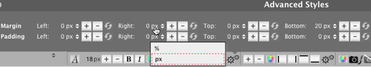
- Click on the Margin Left + button to make your Callout Box narrower from the left, or type in a number. Click on the Margin Right + button to make your box narrower from the right, or type in a number. Click on the – button to reverse the movement.
- Click on the Margin Top + button to move your Callout Box away from the content above it, or type in a number. Click on the Margin Bottom + button to move following content away from the box, or type in a number. Click on the – button to reverse the movement.
- Click on the Padding Left + button to add extra space to the left of the Callout Box's contents, or type in a number. Click on the Padding Right + button to add extra space to the right of the box's contents, or type in a number. Click on the – button to reduce the space.
- Click on the Padding Top + button to add space above the Callout Box's contents, or type in a number. Click on the Padding Bottom + button to add space below the box's contents, or type in a number. Click on the – button to reverse the movement.
You can fine tune the position of your Callout Box and its contents with the Position options of Margin and Padding.
The Margin Left and Right make the space for the Callout Box narrower (+ button) or wider (– button).
You can also click on the number and type in the margin you want.
The Margin Top and Bottom increase the amount of white space (+ button) above and below the Callout Box, or decrease the amount of space (– button).
You can also click on the number and type in the margin you want.
Padding Left and Right add space to the left or right of the Callout Box contents (+ button) or remove space (– button).
You can also click on the number and type in the padding you want.
Padding Top and Bottom add space above and below the Callout Box contents (+ button) or remove space (– button).
You can also click on the number and type in the padding you want.
You can also switch from pixels (px) to percentages (%). Click on px and select % from the small menu. To switch back to pixels, repeat the process.
Click on any of the buttons or a combination to position the Callout Box and the text inside it exactly where you want them.
Shadow
You can help your Callout Boxes stand out by giving them a shadow, which will make them look like they're "floating above" your page. Note, however, that web design is moving back towards a "flat" look (no shadows).
The shadow conforms to the shape of the box. If you rounded the box corners (above), the shadow will also have rounded corners...

You have several options for your shadows -- a color and advanced styles, which include the position of the shadow, the blur distance, and the size of the shadow. Each is discussed below.
Color
- Click on the Color Palette button to select a shadow color.
- Select a color from the palette, enter a hex value, or select a color from Your Custom Colors.
- Click on Set Box Shadow Color to close the overlay, or click on Cancel to close it and keep the current color.
Your box shadow's default color is a standard light gray. This color produces a shadow that's noticed but doesn't overwhelm the visitor.
If you prefer another color, select one from the palette, or enter a hex value into the box. Or you can select an existing color from Your Custom Colors.
Make a final decision after you've customized the advanced styles, next.
If you're dissatisfied at any time, click on the Reset button to clear away all the shadow styling and begin again.
Advanced Styles
- Click on the gears button to open the overlay window. Click on any button to activate the shadow.
- Click on any Position arrow button. Click on each arrow to fine-tune the position.
- Click on the Blur Distance + button to make the shadow more blurred. Click on the – button to make it less blurred.
- Click on the Size + button to make the shadow bigger. Click on the – button to make it smaller.
The Advanced Styles overlay lets you customize the shadow itself. You can position it, blur it, and size it.
Getting the shadow exactly how you want it will require using all three options.
Click on the Position right arrow or down arrow button in the Advanced Styles overlay to activate the shadow.
While you can click on any button to activate the shadow, clicking on right or down starts the shadow in a location where it's usually found (to the right and below the box).
Continue using the arrow buttons until you have the shadow where you want it (pending how it looks after you add Blur Distance and Size).
The Position buttons add a shadow with distinct lines. Blur Distance makes those lines fuzzy. The more distance you add (the + button), the fuzzier the shadow becomes, while also extending farther from the box.
Use the – button to reduce the fuzziness and the distance from the box.
The Size buttons change the amount of shadow.
Click on the + button to increase the amount of shadow. Click on the – button to reduce the amount of shadow.