
Styling the Website Name
The Website Name appears in desktop, 447px and 768px versions of the design. So ensure that it looks good in all three.
To give visitors a consistent experience across all devices, customize it in Desktop only, and let the 447px and 768px versions use the same styling. However, if the font size is too small or too large for each mobile version, customize that.
The Website Name is a clickable link to the home page, so there are styling options for the link part of the name.

If you're ever unsure what a button does, hover over it for a second. Its function will appear as a tooltip.
Text
With the Text tools, you can customize the following for the Website Name text...
-
font type
-
font size
-
alignment
You can also customize other options by opening the Advanced Styles overlay.
Font Picker
- Click on the A button.
-
Hover over a font to preview it. Click on a font to select it.
Or click on Reset to Template Default to return to the default font. - Click on Set Font to save this selection, Cancel to close the tool and make no change.
Click on the A button to change the font of your Website Name. An overlay window opens on top of your template.
Hover over each font to see what it looks like in the preview box at the top of the picker.
Choose a font that suits the look of your template.
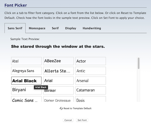
Click on the font you want to use. It will now have a red border.
Click on Set Font to save your selection.
The overlay window will close and the word Menu will immediately appear with the selected font.
Font Size
-
Click on the + button to increase the size of the text. Click on the – button to decrease the text size.
Or click on the number to open the edit box. Double-click on the number and type in the new size.
The Website Name is what you use to add descriptive text at the top of the design. Some designs display it at the top edge of the design, while others display it on the header image.
Click on the + button to make the text larger. Click on the – button to make it smaller.
The Website Name will immediately appear in a different size (one pixel bigger or smaller, per click) in the template. The size indicator will also change to the current pixel size.
Click on that button again to continue increasing or decreasing the font size. The size indicator will continue to change.
You can also click on the current size number (in the screenshot below, 15). This opens a small edit box. Double-click on the number to highlight it, then type in the size you want. Click anywhere in the toolbar to close the box. You'll see your new number there, and the text will display in that new size.
In 768px and 447px, ensure that the font size is large enough that a visitor can easily tap on the Website Name to return to the home page.
Text Color
- Click on the Color Palette button to open the color picker.
-
Select a color from the palette. Click on the rainbow slider to choose another color base for the palette.
Or enter a 6-character hex value. Or, if you've already saved colors, choose one from Your Custom Colors.
Or click on Reset to Template Default to go back to the original text color. - Click Set Text Color to save this selection. Click Cancel to close the tool and make no change.
The color of the word Menu should suit the overall look of your template. More importantly, it needs to stand out against the background color (which you can also customize -- see below).
Click on the Color Palette button. This opens an overlay window with the color picker.
Select the color you want from the palette, enter a 6-character hex value, or select a color from Your Custom Colors.

You can also go back to the original color in your template by clicking on Reset to Template Default.
Click on Set Text Color to save your selection. The overlay window will close. You'll see the word Menu with this color change.
Tips
-
The color inside the small circle is indicated in the hex value box. Alternately, entering a 6-character hex value changes the location of the small circle inside the palette.
-
Dragging the slider in the rainbow column leaves the small circle in the same position on the palette, as the colors change beneath it.
-
As you set colors in the various color pickers (text, border, background), those colors are added to the "crayon box" (called Your Custom Colors) for easy access when editing other parts of your template. Use Your Custom Colors to create a color scheme for your site.
Alignment
- Click on the Align Left, Align Center or Align Right button to choose the text alignment.
The default alignment for the Website Name is left-aligned for some designs, centered for others. Change it if desired.
Advanced Styles
- Click on the gears button to open the Advanced Styles overlay.
- Adjust the letter spacing, word spacing, line height, or font variant, if desired.
- Click on the x in the top left corner of the overlay to close it.
Letter Spacing lets you add or remove space between the letters in every word in every Menu button on every page of your site.
Click on the + button to add space, and the – button to remove space. Or click on the Revert button to go back to the default spacing.
Word Spacing lets you add or remove space between every word in the Website Name.
Click on the + button to add space, and the – button to remove space. Or click on the Revert button to go back to the default spacing.
Line Height lets you add or remove space between every line of your Website Name (if it wraps to 2 lines).
Click on the + button to increase the line height, and the – button to decrease it. Or click on the Revert button to go back to the default line height.Font Variant lets you switch to an ALL CAPS version of your font. Any letter that would normally be capitalized has a slightly larger height than the "lowercase" letters.
Text Transform lets you set each word to start with a Capitalized Letter, or have every word start with a lower text letter, or make every character a CAPITAL.
When you're done, click on the x in the top left corner of the overlay to close it and return to the Site Designer main toolbar.
Normal
Normal is the link style when a visitor has never visited the home page, and is not hovering over the link.
For any first-time visitor, the link will be the default color determined by the template.
- Click on the Color Palette button to change the link text color.
- Click on the B or I button to add bold or italic to the link texts. Click on the U button to change the underlining.
You can change this to any text color that suits your template's overall color scheme, add bold and italics to the links, and remove the underlining.
Normally, links are blue and underlined. But this one is part of your header. So use a color that fits with your color scheme. Also click on the U button twice to remove the underlining.
Visited
The Visited link state is the styling that the Website Name link takes on after visitors click on that link and land on the destination page.
If they return to the previous page, or visit another page with a link to that same destination page, the link will have the Visited styling.
Since this link is in the header, keep it the same color as Normal.
- Click on the Color Palette button to change the link text color for the Visited state.
You can change the text link color for the Website Name Visited state.
The Color Palette button has a V on it to indicate that this is the palette for the Visited state. Click on it to change the Visited state link text color for your template.
The first time you click on the button, you'll see a warning message. Read the message before proceeding.
You'll note that there are no B, I and U buttons for the Visited link state. Whatever is set for the Normal state applies to the Visited state as well.
Hover
The Hover link state is the styling that appears when a visitor places her mouse or trackpad over the home page link (this action is called hovering).
The standard color for hovering over links is red. Choose a variation of red that suits your color scheme, or select a different color.
- Click on the Color Palette button to change the link text color for the Hover state.
- Click on the B or I button to add bold or italic to the link texts. Click on the U button to change the underlining.
You can change the text color, add bold and italics, and remove the underlining.
Since hovering is a temporary action (it doesn't change the way the links look when the mouse is not on the link), you can make changes that will not affect the overall look of your site.
Click on the Color Palette button with the H on it to change the link text color to a variation of red, or to another color.
The first time you click on the button, you'll see a warning message. Read the message before proceeding.
If you made links bold and/or italic for the Normal state, keep those the same here.
Changing them can have text moving back and forth when visitors hover over your links. This is due to the change in character size from the addition of bolding and/or italics.
So the best way to make hovering stand out (other than a color change) is to add add underlining. Click on the U button to add underlining.
Border
You can add (or remove) a border or parts of a border around the Website Name, change its width and color, and change the type of border.
Border Width
- Click on the + button to add a border and increase the width of the border.
- Click on the – button to decrease the width of the border and remove a border.
- Continue clicking to increase or decrease the border width.
Click on the + button to increase the width of the border. This affects all the sides that have a border. You cannot increase the width of an individual border.
Click on the – button to decrease the width of the border. This affects all the sides that have a border. You cannot decrease the width of an individual border.
The four buttons that indicate the left, right, top and bottom (discussed below) will also change. The dark edge around each button will disappear, indicating that the border has been turned off.
Border Color
- Click on the Color Palette button.
-
Click on the palette to select a color. Use the rainbow slider to reach the color base you want to use in the palette.
Or enter a 6-character hex value. Or, if you've already saved colors, choose one from Your Custom Colors.
Or click on Reset to Template Default to go back to the original border color. - Click Set Border Color to save this selection. Click Cancel to close the tool and make no change.
You can change the border's color. Use a color that's part of your template's overall color scheme.
If your template is mostly green, or brown, choosing a brown or green will likely suit your colors. But hot pink or bright red would not.
Click on the Color Palette button to open the color picker overlay.
Select a color from the palette by clicking anywhere on the palette, or by dragging the small circle.
To reach the palette's color base you want (e.g., red, purple, green, etc.), click on and drag the rainbow slider.

The palette color you select appears in the square on the right.
If you know the exact color you want for the border, type in the 6-character hex value in the text box next to the # symbol. Enter only letters and/or numbers -- don't add the # symbol. The color you want will then appear in the square on the right, above the hex value.
If you've selected at least one custom color, you'll be able to select a color from Your Custom Colors as well.
If, after a few color selections, you decide that you don't like any of them, you can start over again by clicking on Reset to Template Default. This will give the border the original color specified in the template's CSS file.
Once you're satisfied with the border color, click Set Border Color to save that selection. Or click Cancel to leave the tool without making any changes to the border color.
Advanced Styles
- Click on the gears button to open the Advanced Styles overlay.
-
Click on any of the four corner buttons to activate rounded corners for that corner.
Or click on the + button to activate all four rounded corners. - Click on the + button to increase the radius of the curve. Clock on the – button to decrease the radius.
- Click on the Revert button to remove all rounded corner styling.
- Click on any of the Style buttons to add that type of border.
- Click on the first Style button to remove any border you added.
- Click on the X in the top left to close the overlay.
You can add rounded corners to the four corners of your boxes using the Website Name's Border advanced styles options.
You can also select the type of border you want (solid, dotted, etc.).
Rounded Corners
Your Website Name does not need borders to round the corners, although visitors will only see the corners if you apply a border or a background color (see the Background section, below).
Click on the gears button to open the Advanced Styles overlay.
Click on the Top Left and Top Right rounded corner buttons to apply rounded corners to those corners. Leave the bottom ones normal so that the Website Name and Website Tagline backgrounds meet evenly.
Click on the + button to increase the radius (the curve) of the rounded corner(s). Click on the – button to decrease the radius.
Continue clicking on the – button to remove all the rounded corners. Or use the Revert button to remove them in one click and restore your Website Name border to its last saved state.
Border Style
You can also choose the type of border you'd like to have around your Website Name. There are four styles to choose from, plus no border (the first button).
-
A regular solid border.
-
A dashed (broken) border.
-
A dotted border.
-
A two-line border. Note that the space between the lines is "hollow" and will show part of any color or background image beneath it.
Position
- Click on the gears button to open the Advanced Styles overlay.
- Click on the Padding Left + button to add extra space to the left of the Website Name, or type in a number. Click on the Padding Right + button to add extra space to the right of the Website Name, or type in a number. Click on the – button to reduce the space.
- Click on the Padding Top + button to add extra space above the Website Name, or type in a number. Click on the Padding Bottom + button to add extra space below the Website Name, or type in a number.
- Click on the Margin Left + button to move the Website Name to the right. Click on the – to reduce the margin.
- Click on the Margin Top + button to move the Website Name down. Click on the Margin Bottom + button to move the Website Name up. Click on the – to reduce the margin.
You can fine tune the position of your Website Name with the Position options of padding and margin.

Padding Left and Right add space to the left or right of the Website Name (+ button) or remove space (– button).
You can also click on the number and type in the padding you want.
Padding Top and Bottom add space above and below the Website Name (+ button) or remove space (– button).
You can also click on the number and type in the padding you want.
You can also switch from pixels (px) to percentages (%). Click on px and select % from the small menu. To switch back to pixels, repeat the process.
Margin Left's + button moves the Website Name towards the right, and the – moves it towards the left.
Margin Top's + button moves the Website Name down. Margin Bottom's + button moves the Website Name up. Click on the – for either option to reverse the move.
Click on any of the Padding and Margin buttons or a combination to position the Website Name exactly where you want it.
Background
You have several options for the background of the Website Name.
You can select a color from the color palette. You can upload a background image.
You can also keep the background as is, with no changes, make it transparent (if it's sitting on a header image), or revert to the default for your template.
If you make it transparent, you may have to change the Website Name Normal color to give it more contrast against the header image.
You also have full control, in the Advanced Styles overlay, of the positioning and tiling of any background image that you upload.
Background Color
- Click on the Color Palette button.
-
Click on the palette to select a color. Click on the rainbow slider to choose another color base for the palette.
Or enter a 6-character hex value. Or, if you've already saved colors, choose one from Your Custom Colors. Or select Transparent.
Or click on Reset to Template Default to go back to the original background color. - Click Set Background Color to save this selection. Click Cancel to close the tool and make no change.
Select a background color that suits your template's overall color scheme. If the background is sitting on a header image, make it suit the color it's sitting on.
For example, if your template's color scheme is various shades of green, you may want to choose another shade of green. Or perhaps a brown color would work.
But a pink or a bright orange would not likely be a good choice.
Click on the color palette button to open the color picker.
Select your color by clicking on the palette or dragging the small circle around the palette. Click on the rainbow slider to reach the desired palette of colors.
Or you can enter a 6-character hex value for the color you want to use.
You can also choose from a color in Your Custom Colors, which is available after you've selected at least one custom color in any of the color pickers. Hover over any color to see where else in your design that you've used that color.
Another option is to choose Transparent. This will make the background beneath your Website Name the color of the header image.

Click on Set Background Color to save your change. The overlay window will close and your new background color will appear.
Upload Background Image
- Click on the Upload Image button.
- Click on the Browse button (Choose File if you're using Safari). Navigate to the desired background image and select it.
- Click on the Upload New Background Image button.
If you would like the Website Name to sit on something more than just a background color, you can upload an image. This would suit a Website Name that's not sitting on the header image.
This is not recommended if the Website Name and Website Tagline are together, unless you have an image that can be made to tile properly across both elements.
Most background images are small images that are then "tiled," that is, they're repeated from left to right, or from top to bottom, or both.
So ensure that you have an image that looks good when repeated multiple times across and down the page, especially since the Website Name can have a different length or height if you change the font size or add padding.
You may have to experiment with different image widths and heights until you find the right image size that looks good when tiled.
Click on the Upload Image button (second from the left in the toolbar). This will open an overlay window...

Click on Browse (Choose File if you're using Safari) to locate the file. Click to select the file.
Click on Upload New Background Image to upload it.
The overlay window will close. You'll see the Website Name with your new background image.
Remove Background Image
- Click on the Remove Image button.
If you uploaded a background image, but decide you'd like to have no image, you can remove it.
The background image appearing in the Website Name will disappear, leaving you with the current background color.
Reset
- Click on the Reset button.
You can also reset the background image changes you made. This resets only the background image settings.
It does not affect the text settings you made (above) or any other changes to your template.
Advanced Styles
- Click on the gears button to open the Advanced Styles overlay.
-
Click on Position V and select from Top, Center and Bottom.
And/or click on Position H and select from Left, Center and Right. -
Click on the Background Repeat Down arrow button to activate image tiling vertically.
Click on the Background Repeat Right arrow to activate image tiling horizontally, if required. - Click again on the Down arrow button to deactivate tiling vertically. Click again on the Right arrow to deactivate tiling horizontally.
- Click on the Download Background Image Down button to download the background image, if your design comes with one.
If you uploaded a background image, you have full control over it.
You can change the position of the image (Position V or Position H) or tile it down the button height or across the width of the Website Name background (Down arrow and Right arrow buttons).
For the background, activate the tiling (there will be a border around the activated button) so that the image fills the entire name area.
Click on the Download Background Image Down button to download the background image, if your design comes with one.
Website Name Text
This is where you enter the words you want to display as your Website Name.
- Click on the Change Text button.
- Type in the text you want to use for the Website Name.
- Click Save to save the new text.
Click on the Change Text button. Type in the text you want to use for the Website Name. Click on Save to save the new name.