Grid Block
Use the Grid Block for special effect, where you want to call attention to some text.
One good use is for doing side-by-side comparisons of two products or services.
Drag a Text Block to each column of the Grid Block and compare two or more products or services. Add text to each column in each row. Add a row for each comparison item.
You can create a Reusable Block with one or more Grid Blocks, along with other blocks. However, you will not want to add a Grid Block to the Nav Column or Extra Column, as there isn't enough room for any content in each of the columns. Learn how to create a Reusable Block.
You can also use the Grid Block in a Sitewide Dot. However, you will not want to add a Grid Block to a Sitewide Dot in the Nav Column or Extra Column, as there will not be enough room for content. Learn how to create a Sitewide Dot.
Click here for a discussion of what to put in each of the 18 Sitewide Dots.
Using the Grid Block Toolbar
The Grid Block allows you to split a column into multiple rows of multiple columns, creating a group of cells.
Inside each cell, drag and drop a Headline Block, Text Block, Image Block (use a small image here), Divider Block, Reusable Block, or Raw HTML Block to give some of your content a different look.
- Drag a Grid Block to your page.
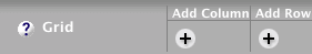
- Click on the Add Column + button to add more columns, as needed.
-
Click on the vertical divider line between two blocks and drag it left or right to resize the two columns.
Or click on one of the cells. The Cell Width portion of the toolbar will appear. Click on the + or – button to increase or decrease the width of that cell. Or click on the width number and type in a width. - Click on the Add Row + button to add more rows, as needed.
- Drag content blocks into each cell.
- Enter text, select an image, paste in some code, etc.
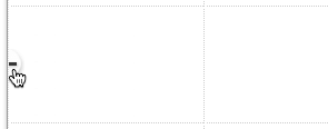
- Click on the – button at the top of any column to remove that column. Click on the – button at the left of any row to remove that row.
Drag the Grid Block to your page. You'll see a gray vertical divider, indicating the default two columns.
If you want to have three or more columns, click on the Add Column + button to add each one.
Depending on the content (text or images) you want to put in the columns, restrict it to no more than four columns.
If you go to five columns, text will begin wrapping after every second or third word, making for very short line lengths.
It's also important to consider how the columns will look on a mobile phone's small screen. You may have to limit the number of columns to two or three. Or use a Responsive Grid Block instead.
You can change the width of the cells in one of two ways...
-
Drag the divider between two blocks to resize those blocks. You'll see the column width displayed in the Cell Width section of the toolbar.
-
Click into any cell. That cell's background color will change and the Cell Width portion of the toolbar will appear. Click on the + or – button to increase or decrease the width of that cell/column. Or click on the width number and type in a width.

If you have more than one row, only one cell will change color. But all the cells in that column will have the same width as the one with the background color.
If you want to have more than one row of columns, click on the Add Row + button to add each one. There's no manual resizing option, as each row's height will be the height of the largest content that you place in that row.
Drag other blocks to each column and add your content.
If you decide that you want to remove a column, click on the – button at the top of that column and confirm the deletion...
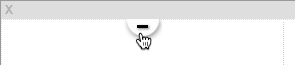
If you decide that you want to remove a row, click on the – button at the left of that row and confirm the deletion...