
Responsive Grid Block
Contents
Responsive Grid Block
The Responsive Grid Block "responds" to the screen width (the "viewport" width) of the device displaying your page.
It responds by removing cells from a row and dropping them to the next line(s), when the width narrows.
Use the Responsive Grid Block for image galleries, or when you want to display chunks of text side by side (in desktop view, at least).
In each of these, on smaller devices, some of the cells (images, or chunks of text) will drop down to new lines. Do ensure that the vertical display of your images or text looks okay on smaller screens by previewing what it will look like in those devices.
You can do that in BlockBuilder by clicking on the Screen size menu to the left of the Head button.
Select each device. Check how your images or text display when viewed in that device emulator.
If everything displays well, continue building the page. If there are problems, change the number of columns that will appear in the various devices (more on this next).
Use the Responsive Grid Block only in the Content Column. There will not be enough room for images or text in multiple cells if you use it in the Nav or Extra Column.
Select Number of Columns Overlay
To use the Responsive Grid Block, drag the block from the block palette and drop it where you want the image gallery or content to appear. An overlay will appear...
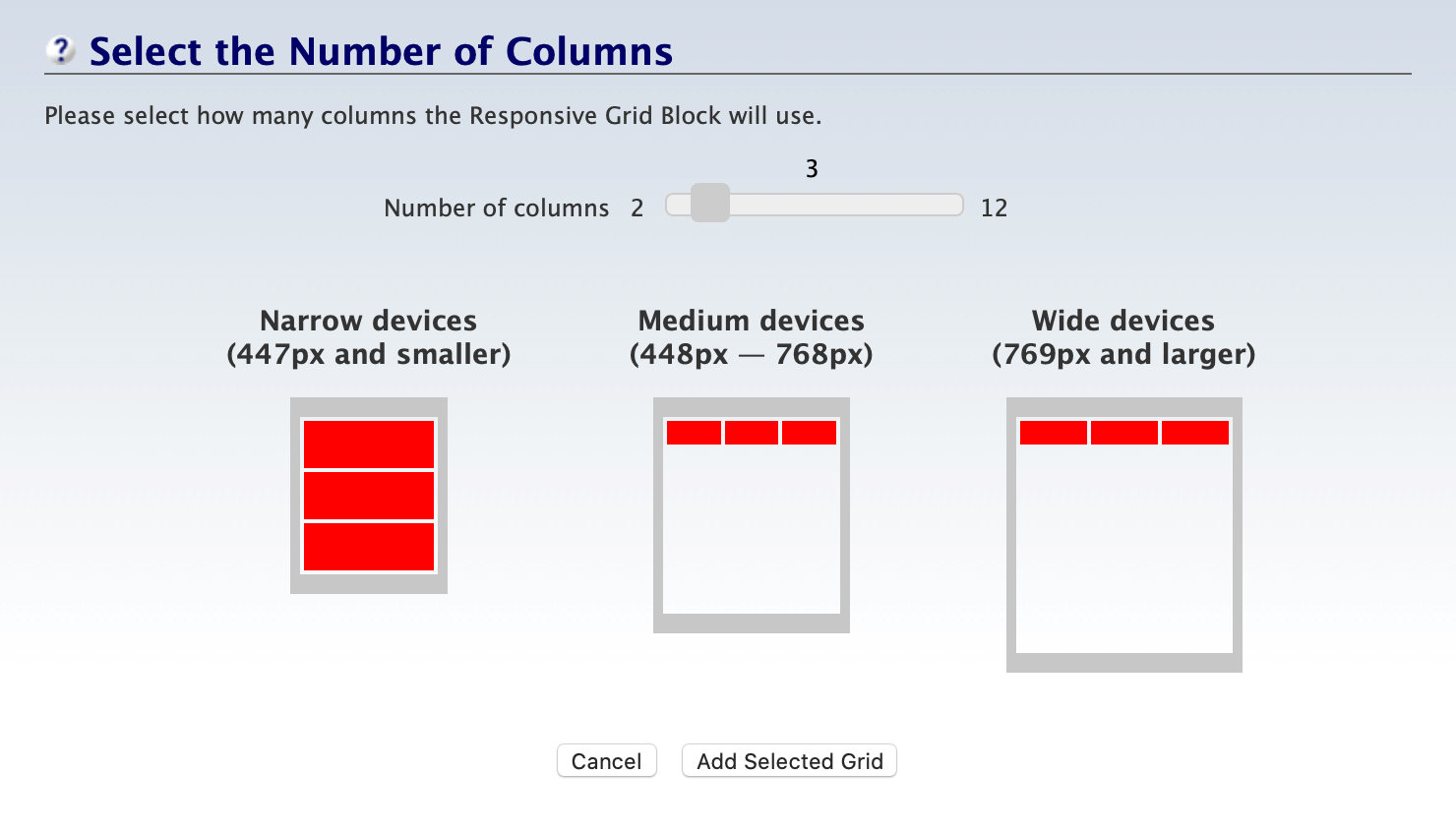
You can select from 2 up to 12 columns of cells. Drag the slider to the right to add columns. Drag it to the left to remove columns.
The three images show how the cells will look on Desktop (and Laptop), Tablet and Mobile devices. Even numbers can be divided into multiple rows on tablets, so you may want to display an even number and have larger cells (or choose 9, which gives 3 rows of 3 cells).
When you've selected the desired number of columns, click on Add Selected Grid. Or click on Cancel to close the overlay without adding the block to the page.
After the overlay closes, you'll see the block in the Content Column, with light gray dividers separating the number of cells you selected. You'll also see the Responsive Grid Block toolbar...

Number of Columns
After placing images or content into each of the cells, if you change your mind and want to add or remove cells, click on the Change button. This will open the overlay again. Make your selection and save it.
Click Cancel to close the overlay without changing the number of columns.
Add Row
You can add rows to the block by clicking on the + button. Another row, with the same number of cells, will appear below the first one. Add as many as you want.
Remember, though, that each row could become 2 or more rows in a tablet, and several rows in a phone. So having multiple desktop rows will result in a lot of scrolling to see all the images/content in a tablet or phone.
Cell Width
Solo Build It! calculates the cell width based on the number of columns in the row. In the screenshot above, the cell width is 14%. That's based on six columns. That's a total of 84% of the width of the Content Column. The remaining width (16%) is the white space that will appear between the cells.
You can change the width of individual cells (which applies to all the cells in the same column, if you have more than one row). Click in a cell, which will turn blue. Click on the + or – button in the toolbar, or click on the percentage number and type in a new width.
If you do change the width of an individual cell (or column), ensure that it does not look odd in a tablet or phone by checking them in the Screen size menu.