
Styling a Template for Tablets and Phones
Site Designer's Screen Size icons let you view how your site will appear on...
-
desktops (computers and laptops)
-
tablets (screen width equal to or narrower than 768px)
-
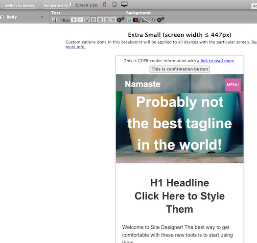
smartphones in vertical orientation (screen width equal to or narrower than 447px)
More importantly, this is also how you design your template for tablets and mobile devices.
As soon as you click on an icon other than desktop, you'll see your content in that screen size. Any styling you do now will affect only your site when it's viewed on devices with either a narrow screen (up to 447px) or a wider screen (up to 768px).
For more on the 447px and 768px "breakpoints," and the recommended customization process, see this help discussion...
You can customize anything you see, including adding a smaller logo image.
Very Important
After you have built your home page and one other page, check how mobile-friendly the page is at PageSpeed Insights...
Based on the report, you may have to increase the text font size in the Content Column in the ≤447 view, and in the Nav and Extra columns (if applicable) and the footer (many designs have smaller text sizes in those areas).
You will almost certainly have to increase the font size of the navigation buttons (vertical or horizontal) if you didn't do it during the first round of customizations.
You may also have to increase the line height for the content by at least two clicks on the + button. Access the line height option by clicking on the gears icon in the Content Column toolbar's Text section (plus the Nav and Extra columns).
It's important to increase the footer's line height if you have a lot of links there. Also do it for the navigation buttons you have in the NavBar or menu items in the horizontal menu at the top of the page.
Click on the gears icon in the Text section of the Nav Links toolbar (or the Horizontal Navigation menu and Horizontal Navigation Submenu toolbars) to change the line height.
Desktop
The desktop mode is the "regular" and default view of Site Designer. It represents how your site will look on all desktop and laptop computers, all tablets, and all phones, until and unless you customize your template for tablets and phones.
This is called "inheritance." Each smaller breakpoint inherits settings from larger breakpoints, unless you customize them.
Design your site for computers before moving on to optimizing it for tablets (768px breakpoint). Then complete your customization work for phones (447px breakpoint). The design you create here for desktops will be the starting point for the tablet and mobile designs.
Tablet and Mobile
- After completing the desktop customizations, click on the tablet icon.
- Make any necessary design changes for that breakpoint (≤768px).
- Repeat the process for small devices (≤447px breakpoint) by clicking on the phone icon.
- Click on Save Style to save your design changes.
As soon as you click on a Screen Size icon, you'll see Site Designer's filler text and images appear in a "screen" for that breakpoint, which emulates how your site will appear in physical devices. This is not perfect though. You'll need to check one or two pages on a tablet and phone once you have your first few pages published.
The text itself will not change, although the font size may increase. Images, boxes and forms will resize.
Scroll down to view your entire template. Place your mouse pointer anywhere on the device's "screen" and scroll. Or drag the scroll bar down the right side of the "screen."
Begin your customization with the 768px breakpoint (the tablet icon). When you've completed it and check that it looks good, move on to the 447px breakpoint (the phone icon).
If the H1 headline's font is too small, make it bigger. And center the major headlines. This will make them stand out more on mobile devices.
Increase the font size to at least 18px. Increase the line height if needed.
You'll also need to tweak things such as your Reminder Box, which may appear very long and very narrow at its default width.
Be sure to click on the Menu in the mobile view to customize the navigation menu. Click on the X to close the menu and return to the template.
You'll notice that text wraps around the images. If the image width is 60% or greater of the width of the viewport, then the image will be centered rather than left- or right-aligned in the live page. This will avoid the issue of having 1-2 words on each line of wrapped text.
Tip
-
As noted above, you can scroll down the text in any of the phones. Place your mouse or trackpad over the "screen" in the device and scroll as you normally do.
This will allow you to see the entire page of filler text and images, etc., including the Nav Column (if you selected a 2-column design) and Extra Column (if you selected a 3-column design).