
Form Builder
Contents
Form Builder
Forms transfer information from your visitors to you. Form Builder gives you a way to provide information in a variety of ways...
-
a "Contact Us" form
-
a single autoresponder confirmation message
-
a sequential autoresponder, delivering up to 26 installments
-
feedback or a reservation form, requiring multiple fields
-
a survey or poll, requiring multiple custom fields.
-
by linking to your MailOut Manager, MailChimp or AWeber newsletter's mailing list
Building your form is always the first step. Think of the form itself as the front-end. It gathers the data. When someone submits a form, a sequence of actions (depending upon which options you selected) starts. A form submission...
-
triggers a Thank You Page, which can give whatever additional information or offer you like.
-
sends an optional single or sequential autoresponder email, as involved or simple as you want.
-
emails an optional notification to you and anyone else you list.
-
stores the collected information in your Get Form Data database, making it available for easy search-and-analysis. (This database is in the BusinessCenter section of Site Central. Click here for details.)
-
if you included the Newsletter Field in your form, adds the user's email address to the MailOut Manager, MailChimp or AWeber mailing list.
Tips
-
Make your selections in Form Builder based on the intended function of the form. So, for example...
If you're creating a simple contact form, a "First Name" field, an "Email Address" field, and a custom "Text Box" field for comments are all that you need. On the other hand, a registration form would require more fields, including custom ones.
Or perhaps you're planning a survey and you want to display the results of certain questions to participants. You would use a "Preset Form" field and a "Custom Form" field as well as the generic fields.
-
Visitors are very hesitant about surrendering personal information online. Ask them only for what's absolutely necessary. Long forms not only intimidate your visitors, but also require a longer time commitment to fill in. Keep your forms as short and simple as possible.
-
Your visitors cannot see a form until you add it to a web page on your site (e.g., inserting a contact form on a "Contact Us" page). If you're using BlockBuilder, you do this with an FBI! Form Block. (See the Form Block help.) If you're uploading your pages, you collect the tag from the Built-in section of the Upload Your Own HTML module and paste it into your page. (See the Uploader help.)
-
Establish a Most Wanted Response (MWR) before you begin to build. Determine what you want your visitor to do, and then create the most appropriate form to make it happen.
For example, let's say that you want to increase your visitor's exposure to your product. So you create a 5-installment e-course, where you integrate soft cross-selling into its content. Your backup response is for your visitor to come back to your site.
OK, it's time to build a form. Later on in the process, you'll set up and activate the other built-in features (i.e., your Thank You page, autoresponder email messages, notification settings).
Let's start...
Edit Form Info
The Form Information overlay gives you the option to name your form, and to add spam protection to it.
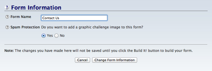
- Click on Change Form Information to save the new Form Name and Spam Protection changes.
To save changes to the Form Name and the Spam Protection, click on Change Form Information.
To leave the overlay without making any changes, click on Cancel.
Form Name
- Enter a descriptive Form Name.
The Form Name is the name you give to the form itself. This name appears in the Form Build It! (FBI!) Library. That's where you'll access your form after you build it, should you want to edit it.
Tip
-
Your visitors do not see this name, so use something that will easily jog your memory when you see it in the FBI! Library.
Spam Protection
- Click No to omit a graphic challenge image.
A graphic challenge image is a method of foiling form spammers.
A person who submits a form must also type in the characters they see in a graphic challenge image.
The default for the spam protection is "Yes."
Important Note
We recommend you use reCAPTCHA instead of FBI!'s built-in spam protection.
Activate the spam protection here, then go to Connected Services in Site Central and activate reCAPTCHA. Return to each form to rebuild it. That will add reCAPTCHA to the form.
Form Headline
- Click in the block and type or paste in the headline for this form.
- Align the headline within the form.
- Size the headline.
The headline is the text that appears at the top of your form, inside the border that contains it. As noted in the block, the headline is optional.
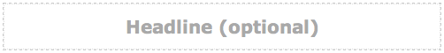
To add a headline, click on the gray text in the block and type or paste in your text.
Tips
-
Similar to web page headlines, write to draw visitors into reading the form. However, this headline does not need to be optimized for the search engines.
-
If you have a long headline, you can force part of it to the next line by adding a <br> tag.
-
Make the form's headline a "2" or a "3."
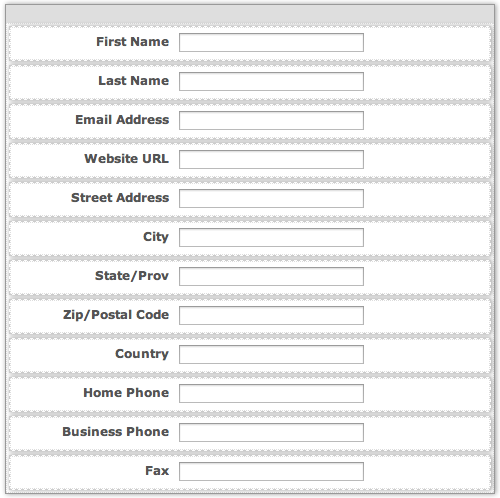
Preset Form Fields
Most forms only need a few of the available preset fields. Keep the required fields to a minimum.
Are you creating a contact form? You only need two preset fields -- First Name and Email Address. A registration form, on the other hand, may need more preset fields.
There are very few good reasons to have "optional" fields (i.e., you check "Use" but not "Req."). They make the form look longer, and most people do not complete optional fields.
To change the text of the preset fields, you must change the Default Text. Return to the Form Build It! Library and click on the Customize Default Text button. Make and save your text changes, which affect all of your forms, then create your new form.
- Click on each of the blocks to display the options for that block.
- Use -- Add a check to select that block to display that text field on your form. Remove the check to remove the text field from the form.
- Req. -- Add a check to require completion of a field before the form can be submitted. Remove the check to make that field optional.
- Label Aligned -- Click on a button to align the field's label to the left of the field, or directly above it.
- Moving Fields -- Change a field's order in the form by clicking on the field and dragging it to the new location.
To view and change the options for each of the preset form fields, click on that block. The default settings will appear in the toolbar.
Make any changes to the field, then move on to the next preset form field.
These changes include...
-
using (Use) a particular field (First Name, Email Address and Country are used by default)
-
requiring (Require) a particular field (First Name, Email Address and Country are required by default)
-
aligning the label (Label Aligned) in a field
-
moving a form field (by dragging the field) to a different part of the preset order.
Reminder
If you need to change the label text for any preset form field, do that with Customize Default Text, available in the FBI! Library.
Custom Form Fields
Custom form fields let you create customer surveys, complex feedback forms, polls, reservation/registration forms, simple referral forms, and so on.
Inserting a custom field into your form is no different than inserting the preset one, except that you have options for collecting data in more than simple one-line text-entry fields.
Custom fields may appear as text boxes, radio buttons, drop down menus or checkboxes.
Customize each field, then add the next custom field until you have the form that meets your needs.
There are four types of custom field block...
-
Text Entry Box Block, which allows your visitors to type text into the form (comments, longer answers, etc.).
-
Radio Buttons Block, which forces visitors to choose only one option by clicking on a round button.
-
Select Menu Block, which gives visitors options in a menu. They select one of the options and the menu closes.
-
Check Boxes Block, which lets visitors choose more than one option by clicking on each check box that applies.
Tips
-
You can use any number and combination of custom fields. However, keep the number of required fields to a minimum.
-
You can display data in non-text fields (i.e., radio buttons, drop down menus or checkboxes) on the form's Thank You page. For example...
Suppose you wish to set up a simple survey. Ask your visitors for their first name, email address, and country of origin, all of which are preset form fields. Let's imagine that the form also asks, in a custom form field, which color widget the visitor prefers (red, yellow, or blue).
In order to display the current results for all to see, set that option while editing your Thank You page in Form Build It! Library.
Results will only be given for "Country" (because the country is chosen from a drop down menu) and for "Widget Color" (selected by radio button). No results can be shown for fields where the user types an answer into a text box, since the variations there are infinite.
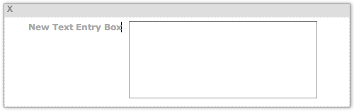
Text Entry Box
Text boxes can be either single rows (perfect for collecting single word answers), or multiple rows, which are ideal for any text fields that require a lot of feedback from visitors (such as comments).
- Drag the Text Entry Box Block to where you want the form field to appear.
- Req. -- Add a check to require completion of the text entry box before the form can be submitted. Remove the check to make the field optional again.
- Label Aligned -- Click on a button to align the field's label to the left of the field, or directly above it.
- How Wide? -- Click on the + button to widen the box. Click on the – button to make the box narrower.
- How many Rows? -- Click on the + button to add more rows to the box. Click on the – button to reduce the number of rows.
- Change the field's order in the form by clicking on the gray bar at the top of the block and dragging the block until it appears where you want it.
- Click on the gray New Text Entry Box text to add the label for the box.
- Click on the X at the left edge of the gray bar to delete the Text Entry Box from the form. Instead of deleting it, you can hide it from your visitors by removing the check from the Use section of the toolbar.
Add a text box to your form by clicking on and dragging the Text Entry Box Block from the block palette. Drop the block where you want it to appear in the form's order (you can change that later if necessary).
Dropping the block displays the Text Entry Box toolbar.
The Use option is active (it has a check) by default. You can hide the text box from the form later by unchecking that box.
The Req. option is not active (it has no check) by default. Add a check to make entering some text into the text box required before the form can be submitted.
If you're putting the form in the Content Column of your page, align the label on the left (the default). If you plan on creating a narrow form (perhaps a one question questionnaire) for the Extra Column, align the label on the top (above).
For a wide form, leave the width at the default of 35 characters, or make it wider by clicking on the How Wide? section's + or – buttons until you reach the width you want.
If you're collecting data that requires very few words, click the – button in the How many Rows section of the toolbar until you reach "1." If you need to collect more data, use a larger number of rows to build a "comments" box.
Once you're happy with the box size, add the label for the box. Click on the gray New Text Entry Box text. For a left-aligned label, your cursor will appear just after the "x" in "Box." For a top-aligned label, the cursor will appear just before the "N" in "New."
Type in your label. If it's long, add a <br> tag to drop part of it to the next line. However, keep it as short as possible. You don't want to overwhelm users with form text.
You can change where the box appears in the form by clicking on the gray bar at the top of the block and dragging the block to the new location.
If you decide that you don't want that block, click on the X at the left of the gray bar to delete it. If you want to keep the block but hide the box in the form itself, uncheck the Use check box in the toolbar (discussed above).
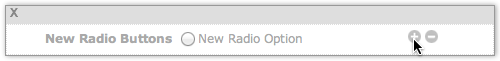
Radio Buttons
Use radio buttons when you want visitors to select just one option (e.g., male or female).
- Drag the Radio Buttons Block to where you want the form field to appear.
- Req. -- Add a check to require completion of the text entry box before the form can be submitted. Remove the check to make the field optional again.
- Label Aligned -- Click on a button to align the field's label to the left of the field, or directly above it.
- Click on the gray New Radio Buttons text to add the label for the form field.
- Click on the gray New Radio Option text to add the label for the first button.
- Click on the gray + to the right of the text to add another radio button. Click on the gray – to remove the radio button.
- Change a radio button's order inside the block by clicking on the button next to the – button and dragging the radio button to a new location.
- Change the field's order in the form by clicking on the gray bar at the top of the block and dragging the block until it appears where you want it.
- Click on the X at the left edge of the gray bar to delete the Radio Buttons block from the form. Instead of deleting it, you can hide it from your visitors by removing the check from the Use section of the toolbar.
Add radio buttons to your form by clicking on and dragging the Radio Buttons Block from the block palette. Drop the block where you want it to appear in the form's order (you can change that later if necessary).
Dropping the block displays the Radio Buttons toolbar.
The Use option is active (it has a check) by default. You can hide the radio buttons from the form later by unchecking that box.
The Req. option is not active (it has no check) by default. Add a check to make clicking on a button required before the form can be submitted.
If you're putting the form in the Content Column of your page, align the label on the left (the default). If you plan on creating a narrow form (perhaps a brief questionnaire) for the Extra Column, align the label on the top (above).
Add the label for the radio buttons. Click on the gray New Radio Buttons text. For a left-aligned label, your cursor will appear just after the "s" in "Buttons." For a top-aligned label, the cursor will appear just before the "N" in "New."
Type in your label. If it's long, add a <br> tag to drop part of it to the next line. However, keep it as short as possible. You don't want to overwhelm users with form text.
You can change where the radio buttons appear in the form by clicking on the gray bar at the top of the block and dragging the block to the new location.
If you decide that you don't want that block, click on the X at the left of the gray bar to delete it. If you want to keep the block but hide the buttons in the form itself, uncheck the Use check box in the toolbar (discussed above).
To add individual radio buttons and button text, enter the text for the first button, then click on the + button to add the next button. Repeat the process for each button you want to add.
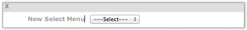
Select Menu
Drop-down menus are similar to radio buttons (the user can select only one answer), but they're best to use when you have limited space and/or want to tuck away a large number of choices, such as states or provinces.
- Drag the Select Menu Block to where you want the form field to appear.
- Req. -- Add a check to require completion of the text entry box before the form can be submitted. Remove the check to make the field optional again.
- Label Aligned -- Click on a button to align the field's label to the left of the field, or directly above it.
-
Click on the Edit Menu Options button to open an overlay.
- Click in the text box and type in the text for the first menu item.
- Click on the gray + to the right of the text box to add another menu item. Click on the gray – to remove the menu item.
- Change a menu item's order inside the block by clicking on the button next to the – button and dragging the menu item to a new location.
- Click on Done when you have your menu items the way you want them.
- Click on the gray New Select Menu text to add the label for the form field.
- Change the field's order in the form by clicking on the gray bar at the top of the block and dragging the block until it appears where you want it.
- Click on the X at the left edge of the gray bar to delete the Select Menu block from the form. Instead of deleting it, you can hide it from your visitors by removing the check from the Use section of the toolbar.
Add a menu to your form by clicking on and dragging the Select Menu Block from the block palette. Drop the block where you want it to appear in the form's order (you can change that later if necessary).
Dropping the block displays the Select Menu toolbar.
The Use option is active (it has a check) by default. You can hide the menu from the form later by unchecking that box.
The Req. option is not active (it has no check) by default. Add a check to make selecting a menu item required before the form can be submitted.
If you're putting the form in the Content Column of your page, align the label on the left (the default). If you plan on creating a narrow form (perhaps a brief questionnaire) for the Extra Column, align the label on the top (above).
Click on Edit Menu Options to open an overlay. In the text box, type in the text for the first menu item.
To the right of the box, click on the gray + button to add a new item. Repeat for as many items as you want included in the menu.
Click on the – button next to any item to remove that item from the menu.
Add the label for the menu. Click on the gray New Select Menu text. For a left-aligned label, your cursor will appear just after the "u" in "Menu." For a top-aligned label, the cursor will appear just before the "N" in "New."
Type in your label. If it's long, add a <br> tag to drop part of it to the next line. However, keep it as short as possible. You don't want to overwhelm users with form text.
You can change where the menu appears in the form by clicking on the gray bar at the top of the block and dragging the block to the new location.
If you decide that you don't want that block, click on the X at the left of the gray bar to delete it. If you want to keep the block but hide the menu in the form itself, uncheck the Use check box in the toolbar (discussed above).
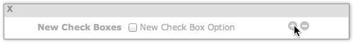
Check Boxes
Use checkboxes whenever there might be multiple answers to a single question.
- Drag the Check Boxes Block to where you want the form field to appear.
- Req. -- Add a check to require completion of the text entry box before the form can be submitted. Remove the check to make the field optional again.
- Label Aligned -- Click on a button to align the field's label to the left of the field, or directly above it.
- Click on the gray New Check Boxes text to add the label for the form field.
- Click on the gray New Check Box Option text to add the label for the first box.
- Click on the gray + to the right of the text to add another check box. Click on the gray – to remove the box.
- Change a check box's order inside the block by clicking on the button next to the – button and dragging the check box to a new location.
- Change the field's order in the form by clicking on the gray bar at the top of the block and dragging the block until it appears where you want it.
- Click on the X at the left edge of the gray bar to delete the Check Boxes block from the form. Instead of deleting it, you can hide it from your visitors by removing the check from the Use section of the toolbar.
Add check boxes to your form by clicking on and dragging the Check Boxes Block from the block palette. Drop the block where you want it to appear in the form's order (you can change that later if necessary).
Dropping the block displays the Check Boxes toolbar.
The Use option is active (it has a check) by default. You can hide the check boxes from the form later by unchecking that box.
The Req. option is not active (it has no check) by default. Add a check to make clicking on at least one check box required before the form can be submitted.
If you're putting the form in the Content Column of your page, align the label on the left (the default). If you plan on creating a narrow form (perhaps a brief questionnaire) for the Extra Column, align the label on the top.
Add the label for the check boxes. Click on the gray New Check Boxes text. For a left-aligned label, your cursor will appear just after the "s" in "Boxes." For a top-aligned label, the cursor will appear just before the "N" in "New."
Type in your label. If it's long, add a <br> tag to drop part of it to the next line. However, keep it as short as possible. You don't want to overwhelm users with form text.
You can change where the check boxes appear in the form by clicking on the gray bar at the top of the block and dragging the block to the new location.
If you decide that you don't want that block, click on the X at the left of the gray bar to delete it. If you want to keep the block but hide the check boxes in the form itself, uncheck the Use check box in the toolbar (discussed above).
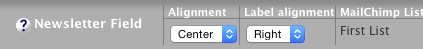
Newsletter Field
You can, if desired, give people who use your forms the option to sign up for your MailOut Manager, MailChimp or AWeber newsletter.
- Drag the Newsletter Field Block as the last block before the Submit button.
- Select which newsletter service you want to use. If you select MailChimp or AWeber, also select which list you want to use (if you have more than one list).
- Select the Alignment and Label Alignment
- Click on Subscribe to Newsletter and enter the text you want to use for the checkbox.
To do that, drag the Newsletter Field Block to the page. Drop it just above the Submit button.
Click on the newsletter to add, MailOut Manager, MailChimp or AWeber. If you selected MailChimp or AWeber, choose the list you want to use.
Click on the Select button to close the overlay. The block will appear in the form.
Select the alignment of the label and text box. The default is centered.
Then select the alignment for the label (the default is to the right of the checkbox).
Click on Subscribe to Newsletter and enter the text you want to use for the checkbox. You may want to use the name of your newsletter, so that form users know what they're signing up for.
The last section of the toolbar indicates whether you have a MailOut Manager list, a MailChimp list or an AWeber list. If you used a MailChimp or AWeber list, it will tell you which list you're using with this form. In the screenshot above, the MailChimp list called "First List" is connected with this form.
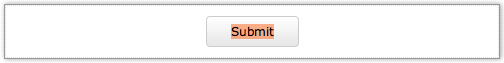
Submit Button
- Double-click on the word "Submit" to highlight it.
- Customize the button instruction by entering your own text.
You don't have to use the word "Submit" for your button instruction.
If your form asks for comments about your site, your button could say "Send Us Your Comments."
If the form starts an autoresponder e-course, the button could say "Request Your E-course."
Tip
-
Make your button's text compelling, but as short as possible. It is, after all, a button.
Note that the button style you see in Form Builder is not the button style you'll see in the preview, or in the live form. The live button will be thinner, and will widen to fit the length of your button text.
Preview and Build
- Click on the Preview button in the top right to see what your form will look like.
- Click on the Build It! button in the top right to build your form.
You can preview what the form will look like (without styling) by clicking on the Preview button.
Note that since there's no styling applied, some text will display larger or smaller than other text.
If you need to make any changes (e.g., matching label alignments, hiding a form field), close the window, make your changes, and preview again.
Once you're satisfied with the form itself, click on Build It!. This will build the new form and add it to your Form Build It! Library. It's also now available in the FBI! Form Block in BB2, and in the Built-in Functions section of Upload Your Own HTML.
To test or edit the new form, return to the library.