
Container Block
Contents
Container Block
There are five reasons for using the Container Block...
-
To make parts of the page appear only on desktop/laptop computers and tablets, and make other parts only appear on mobile devices (smartphones).
-
To add a Callout Box or a Reminder Box to your page.
Callout Boxes are for drawing attention to important chunks of text (use bold and/or italics for a few words or a sentence; use a Callout Box for a paragraph or more, or a long list).
Reminder Boxes are for important action items, reminders, hints, warnings, alerts, etc.
-
To place a set of blocks into the Reusable Block Library as one block. This then allows you to add the entire set of blocks to multiple pages by dragging and selecting just one Reusable Block to each page.
You can use this to add content to multiple pages, or to add a "content template" to those pages (which allows you to change the content on the page, but not in the Reusable Block itself).
For example, create a unique navigation for several Extra Columns (e.g., one for each Tier 2 section of your site) by dropping Image, Text and Headline blocks, even Divider and Raw HTML blocks into a Container Block.
Save that block to the Reusable Block Library, then add it to a related page by selecting that Reusable Block from the selector tool, whenever needed.
Adding that one block pulls in the images, text, headlines, code, etc., displaying it all on the page.
Or clone the block and use it as a one-time-only content template on that page. Change the content inside the template does not affect the content inside the Reusable Block itself.
-
To move a group of blocks as one unit within your page.
For example, some testing in a few months may indicate that a block of text and an image for an affiliate product may not be doing well near the bottom of the page.
If you had placed them in a Container Block when you built the page, you can now simply drag that one block to a location higher up the page, where the affiliate text and image will now appear.
-
To add "stripes" across the width of a Stripe-ready template. See the Site Designer Gallery help for more details on what a Stripe-ready responsive design is.
If you selected a stripes template in the Site Designer gallery, the default BB2 will show all three stripes (Stripe 1, Stripe 2, Stripe 3) in the builder, along with some default text.
Think ahead when building pages. If an image and some text should always appear together, but not on every page, drag a Container Block to your page, then drag an Image Block and a Text Block to the Container Block. Finally, save that container as a Reusable Block.
However, do not use a Container Block to create a Reusable Block with a lot of text. Each page should have unique content.
If you must have common content on many of your pages (e.g., an affiliate/earnings source disclaimer on all affiliate pages), keep it as short as possible. Or, even better, create a page for that common content and link to it from every page that needs it.
(Note, however, that an affiliate disclaimer needs to appear on each page with affiliate links. Amazon requires one near or next to each affiliate link on the page.)
Tip
-
When you create a legal-type page (e.g., an earnings source disclaimer page), it's of no value to the search engines.
So in the Page Information overlay, add a check to keep the page from being indexed by the engines. Also add the rel="nofollow" attribute to any links to that page.
To create a "container" of content, drag the Container Block to your page.

- Drag a Container Block to your page. Customize the container. Select the Preset, if desired.
- Drag other blocks into the block. Enter text, add an image, etc. in those blocks.
- Add any desired styling.
Select the Preset, or leave it unselected to use it for showing and hiding content based on the device size (computer / laptop, tablet or smartphone).
Drag other blocks (Text, Headline, Image, etc.) inside the Container Block and add text or other content to those blocks.
Also add any styling that you want for this particular container. See below for details.
Build the page, or create a Reusable Block from this Container Block, then build the page. Click here to learn how to create a Reusable Block.
Align
You can align the container to the left or right, or center it.
- Click on the Left, Center or Right button to select the desired alignment.
If you want a particular Callout Box or Reminder Box to have a different alignment than the default, select Left, Center or Right.
You can also use this to have special effects alignment. Align text in a Text Block one way, and align the container another way. Test this to make sure that it provides a good user experience before doing too much of it on your site.
Font
The Font section lets you customize all or part of the text in the Container Block. Use it if you want to change the text styling in a Callout Box or a Reminder Box, or if you want to create a custom stripe.

The tools available let you...
-
change the font of the text
-
make the font of the text bigger or smaller
-
change the color of the text
-
strip out any styling to text that you highlight
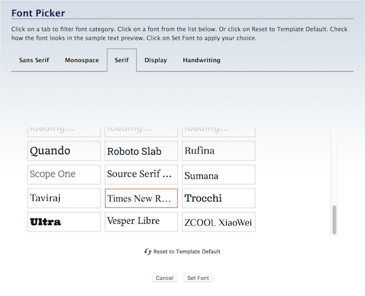
Change the Font
- Click on the A button.
- Hover over a font to preview it. Click on a font to select it.
- Click on Set Font to save this selection.
Highlight all the text for which you want a different font. Then click on the A button.
Preview each font by hovering over its name and viewing the preview text.
Select the font you want to use, and click on Set Font to save the change.
The text will immediately display the selected font.
There's no border around this button after clicking because the font button is never inactive. There's always a font applied to the text.
The system fonts load faster, and will create fewer reports (if any) in the Core Web Vitals section of Google Search Console and PageSpeed Insights.
The remaining fonts are Google fonts. They often look better than the system fonts, but they come at a price of issues that you may have to fix after you've published a few pages.
Important Note: We do not recommend changing fonts here in BB2. Change them in Site Designer. If you change them here in BB2, and later decide to switch to a new template, you may have to edit each page individually to change the fonts again.
Make the Font Bigger/Smaller
- Click on the + button to increase the size. Click again to make the font larger.
- Click on the – button to decrease the size. Click again to make the font smaller.
- Or click on the number to open the edit box. Double-click on the number and type in the new size.
Highlight all the text for which you want to change the font size. Then click on the + or – button.
The text will immediately appear in a different size (one pixel bigger or smaller, per click). Click on that button again to continue increasing or decreasing the font size.
You can also click on the current size number (in the screenshot below, 16). This opens a small edit box.
Double-click on the number to highlight it, then type in the size you want. Click anywhere in the toolbar to close the box. You'll see your new number there, and the text will display in that new size.
There's no border around these buttons after clicking because the font size is never inactive. There's always a size applied to the text.
Change the Text Color
- Click on the Color Palette button.
-
Click on the palette to select a color. Click on the rainbow slider to change the color base of the palette.
Or enter a 6-character hex value.
Or click on one of Your Custom Colors.
Or click on Reset to Template Default to switch back to the text color you saved in Site Designer.
- Click on Set Color to save this selection. Click Cancel to close the tool and make no change.
You can change the font color of text.
(Note: this does not change the background color on which the text sits.)
Highlight all the text for which you want a different color. Then click on the Color Palette button. An overlay will open.
Select the color you want. Drag the rainbow slider to change the color base of the palette.
Or enter a 6-character hex value (do not include the # symbol).
Or click on one of Your Custom Colors. Note that you can't add new colors here. The available colors come from your selections in Site Designer.
You may decide later that you prefer the color you saved in Site Designer. Click on Reset to Template Default to switch back to that color.
Click on Set Color. The window will close and the text will immediately appear with that color.

There's no border around this button after clicking because the font color is always active. There's always a color applied to the text.
Tip
-
Select colors that complement, or match, your site design's colors.
Remove Styling
- Click in the block that has the text you want to unstyle. Press Ctrl-A/Command-A to highlight all of the text in the block.
- Click on the T button with the diagonal line through it.
If you want to remove any styling that you added to a Text Block, click in the block, then highlight all the text in that block using Ctrl-A/Command-A.
Click on the T button with the diagonal line through it. Confirm that you want to remove the styling.
Border
You can add a border to the container to make a block of text stand out.
Border Width
- Click on the + or the – button to increase or decrease the width of the border.
You can add a border and select its width.
You can decrease the width to 0, effectively making the borders disappear.
Click on the + button to increase the width of the border. This affects all the sides that have a border. You cannot increase the width of an individual border.
Click on the – button to decrease the width of the border. This affects all the sides that have a border. You cannot decrease the width of an individual border.
The four buttons that indicate the left, right, top and bottom (discussed below) will also change. The dark edge around each button will disappear, indicating that the border has been turned off.
Border Color
- Click on the Color Palette button.
-
Click on the palette to select a color. Use the rainbow slider to reach the color base you want to use in the palette..
Or enter a 6-character hex value. Or, if you've already saved colors, choose one from Your Custom Colors.
Or click on Reset to Template Default to go back to the original border color. - Click Set Border Color to save this selection. Click Cancel to close the tool and make no change.
You can make the border stand out more by changing its color. Use a color that's part of your template's overall color scheme.
If your template is mostly green, or brown, choosing a brown or green will likely suit your colors. But hot pink or bright red would not.
Click on the Color Palette button to open the color picker overlay.
Select a color by clicking anywhere on the palette, or by dragging the small circle.
To reach the palette's color base you want (e.g., red, purple, green, etc.), click on and drag the rainbow slider.

The palette color you select appears in the square on the right.
If you know the exact color you want for the border, type in the 6-character hex value in the text box next to the # symbol. Enter only letters and/or numbers -- don't add the # symbol. The color you want will then appear in the square on the right, above the hex value.
If you've selected at least one custom color, you'll be able to select a color from Your Custom Colors as well.
If, after a few color selections, you decide that you don't like any of them, you can start over again by clicking on Reset to Template Default. This will give the border the original color specified in the template's CSS file.
Once you're satisfied with the border color, click Set Border Color to save that selection. Or click Cancel to leave the tool without making any changes to the border color.
Borders On and Off
- Click on the left, right, top or bottom button to add or remove that part of the border.
You can have borders around all four sides of the container, around just one, or around two or three sides.
Turn on a border, or turn an existing border off, by clicking on its button.
Width
The default Container Block width is the one you set in Site Designer for a Callout Box and for a Reminder Box.
You can make each container any width you want with the BlockBuilder menu selector. However, for the best user experience, use the Site Designer widths consistently. If you plan to add a box to the Nav column or Extra column, set the width to 100% so that it takes up the full width of the column.
- Click on the menu to select a width.
If you make the width of containers less than 100%, then alignment (above) will move them to the left, right or center. A 100% width container will not change position.
Background
You can select a background color for each container. Again, for the best user experience, try to keep all Callout Boxes and Reminder Boxes the same color (which you set in Site Designer).
You can also use one large image as the background for each stripe. Or use a smaller image and tile it across and/or down the stripe. All the content you add to the stripe (including other images using the Image Block) will sit on top of this background image.
Background Color
- Click on the Color Palette button.
-
Click on the palette to select a color. Use the rainbow slider to reach the color base you want to use in the palette.
Or enter a 6-character hex value. Or, if you've already saved colors, choose one from Your Custom Colors. You can also select Transparent.
Or click on Reset to Template Default to go back to the original background color. - Click Set Color to save this selection. Click Cancel to close the tool and make no change.
One way to make a container is to give it a background color. Or make a stripe stand out by diving it a different background color from the three default stripe colors. You do that here.
Remember, however, that if you change the background color of a stripe, you may need to change text and headline font colors to make them easy to see and read on the stripe.
If you do select a different background color, ensure that there's a high contrast between text and the color.
Choose a color that suits your template's overall color scheme.
Click on the Color Palette button to open the color picker overlay.
Select your color by clicking on the palette or dragging the small circle around the palette. Click on the rainbow slider to reach the desired palette of colors.
Or you can enter a 6-character hex value for the color you want to use.
You can also choose from a color in Your Custom Colors, which is available after you've selected at least one custom color in any of the color pickers. Hover over any color to see where else in your design that you've used that color.
Click on Set Color to save your change. The overlay window will close and your new background color will appear.
Upload Background Image
- Click on the Upload Image button.
- In the overlay tool, click on the Browse button (Choose File if you're using Safari). Navigate to the desired background image and select it.
- Click on the Upload New Background Image button.
You can add a background image to a container or a stripe.
For a stripe, you'll need to upload an image that's as wide or wider than the template you're using (1,000px is the minimum width you should upload).
When you first upload the image, you'll see part of it inside the stripe. As you add content to the stripe, you'll see more and more of the background image.
If you add too much content to the stripe, you might "run out" of background image. If that happens, you'll have to upload a larger version of the image.
Very Important
If you do use a background image in a stripe, ensure that the content you add to the stripe can still be seen and read easily. You may have to change the text or headline font color to a greater contrast color. You may also have to change the width of the content, and its alignment, which are both done in the Container Block toolbar.
Click on the Upload Image button (second from the left). This will open an overlay window...

Click on Browse (Choose File if you're using Safari) to locate the file. Click to select the file.
Click on Upload New Background Image to upload it.
The overlay window will close. You'll see the stripe with your new background image.
Reset
- Click on the Reset button to return to the default, which is no image.
You can also reset all the changes you made to the background image, which restores the default, which is no image.
This resets only the background image settings for the stripe.
Advanced Styles
- Click on the gears button to open the overlay.
- Click on Size and select your desired background image size.
-
Select the position (vertical and horizontal) for the background image you uploaded.
Or tile the image down the stripe or across to the right edge of the stripe.
If your background image (especially in a stripe) has a visual element that you want in a certain position inside the stripe, set its location by clicking on the gears button and customizing how it will display.
If you plan to use one image with no tiling, you have several options in the Size menu.
-
auto -- this setting displays the image for the height and width of the content inside the container (text, etc.). More image is shown as the height of the container increases (which happens as more text or other content makes the container larger.
-
100% auto -- this setting displays the width at 100%, then resizes the height to fill the container without changing the aspect ratio. If the content inside the container isn't very high (1-2 lines of text), you'll see only the top of the image. This will grow down the image as the container height increases.
Note: If the image is not high enough, it will tile down the page to fill the container's height.
-
auto 100% -- this setting displays the height at 100%, then resizes the width to the appropriate aspect ratio. Note: If the image is not wide enough, it will tile across the page to fill the container's width. If the container height is very small (one or two lines of text), the image could tile across the container several times.
-
contain -- this setting scales the image as large as possible while maintaining the image aspect ratio. If the consistent ratio leaves empty areas (to left and right, or to top and bottom), the background color of the container displays.
-
cover -- the opposite of contain, when the image is cropped (left and right, or top and bottom) if it's too large for the container.
If you have a small image that you want to use, tile the image down the stripe or across to the right edge of the stripe.
Position
The Position options include margin and padding.
- Click on the gears button to open the Advanced Styles overlay.
- Click on any of the Margin buttons to move the container away from other page elements around it.
- Click on any of the Padding buttons to move the content of the container away from the edges of the container.
The Margin buttons will move the container away from the elements surrounding it.
The Top button will move the container away from the element above the container. The Bottom button will move the following element away from the bottom of the container.
The Left button will move the container away from the element to the left of the container. The Right button will move it away from the element to the right.
The Padding buttons will move the content inside the container away from the edges of that container. If you want to see the padding changes, add a border or a background color to the container.
The Top button will move the content away from the top of the container. The Bottom button will move it away from the bottom of the container.
The Left button will move the content away from the left edge of the container. The Right button will move it away from the right edge of the container.
If you added a border or background color to see the padding changes, remember to remove the border or color if you don't want to keep it.
Preset
You can create a Callout Box or Reminder Box on any page of your site by dragging over a Container Block and then selecting either option from the Preset menu.
You can also add one of three different stripes (you customized them in Site Designer), which will fill the full width of the template, if you selected a Stripe-ready responsive design in the Gallery.
If you customized a stripes template in Site Designer, each time you build a page, the three stripes will be visible, along with some default text that fills each stripe.
You'll only need to use the Preset menu if you want to add another stripe between two of the three default ones, or at the end, after Stripe 3.

- Click on the Preset menu.
- Select CalloutBox, ReminderBox, Stripe1, Stripe2, or Stripe3.
-
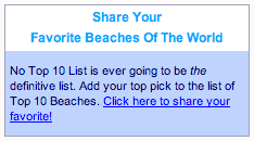
Drop a Text Block into the Callout Box, or into the Reminder Box. Also drop a Headline Block in the Reminder Box, and set it to H4.
If you selected one of the stripes, use any type of block that will display content or a form on your page.
Click on the Preset menu to view the five options. Click on an option to add it to the Container Block.
For a Callout Box, drop a Text Block and type or paste in your callout text.
For a Reminder Box, first drop a Headline Block, select the H4 Headline from the Size menu, and add your headline text. Then drop a Text Block and add the reminder text.
You must use the H4 headline with a Reminder Box if you want the headline to be styled properly. The headline is styled in Site Designer, and the headline size that's styled there is the H4.
For a stripe, you can add any type of block (Headline, Text, Image, Divider, Raw HTML, C2 Invitation, FBI! Form, Responsive Grid, etc.).
Tip
-
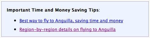
You can also add an image to a Callout Box or Reminder Box, but you need to add enough text to force the box to extend beyond the image. Otherwise, the top of the image will be inside the box, and the bottom of it will in the regular content section.
If you want to add an image to a Reminder Box, ensure that the width of the image is small enough to fit into the box.
You can add an image to a stripe using the Image Block. You can also add a background image to the stripe you dropped onto the page. It will appear only in this stripe.
Show This Block on...
You can make content appear only on desktops/laptops (plus tablets), or only on mobile devices (smartphones) by dragging over a Container Block, adding new content (or dropping in existing content) and selecting one of two options.
This is optional unless you have a specific need to show some content only on a computer/tablet, or only on a mobile phone.

If content will appear in both desktops/tablets and mobile phones in the same location, do nothing with that content.
This applies to all of the text content in the Content Column, and your vertical navigation in the Nav Column or horizontal navigation added to the header image.
- Click on the "Show This Block on..." menu and select Mobile devices or Desktop / Tablets.
- Click on the "Show This Block on..." menu and select All devices to convert something to show on both desktop/tablets and mobile devices.
For existing content, drop a Container Block just above or below the content. Drag the content block into the container. Select Desktop / Tablets or Mobile devices.
Drag another Container Block just below the first container.
Drop in the same blocks, and then add in the same content (e.g., What's New Box) or different content (e.g., a narrower Facebook Like button). Select the opposite option (Mobile devices or Desktop / Tablets).
Then drag the second Container Block to the location where you want it to display.
If you're creating new content that should display on only one type of device, drop in a Container Block and start from there.
The settings you created in Site Designer for the Callout Box and Reminder Box are global; they affect every box you add, unless you style them here with the Container Block toolbar.
With the styling options below, you can add borders and background colors to Text Blocks and Raw HTML Blocks, and align the container independent of the alignment of the contents of the container.
CSS Class(es)
You can customize each container on a page individually, use CSS classes.
es) toolbar")
Note: You must add class styling in Site Designer's Add Custom CSS box if you want to style containers in BB2.
If you do not add the styling in Site Designer, adding CSS classes to a container will have no effect.
- Click in the CSS Class(es) text box. An overlay will appear.
- Enter all the class names you want to style this particular container.
- Click on Edit CSS Class to save the class names.
Each class must be one word. That one word can be a single word (e.g., container1) or a hyphenated word (e.g., container2-news, container3-red-narrow).
You can apply multiple classes to the container simply by adding each class name in the box. For example, adding "container-news container-half" will apply all the styling in "container-news" and then all the styling in "container-half."
To add or edit class names, click in the CSS Class(es) text box. In the overlay that opens, type or paste in the class names you want to use to style the container. Click on Edit CSS Class to save the changes.